



Most church bulletin design fails before anyone even reads the first line—because it’s treated as a necessary nuisance instead of a ministry tool.
When a bulletin is just an “info dump,” people skim it, bin it, or leave it on the seat. When it’s intentionally designed, it becomes something far more powerful: a weekly invitation into the life of a church family.
I’ve spent years helping churches move from cluttered, forgettable notice sheets to clear, consistent, Christ-centred communication. The difference in engagement, connection, and even event attendance is not theoretical—I’ve watched it play out week after week in real congregations.
This isn’t about making things “pretty” for the sake of it. It’s about stewarding attention well, reinforcing your mission visually, and using church bulletin design to help people actually feel like they belong.
Why Most Church Bulletin Designs Fail Their Communities
The biggest misconception about church bulletin design is simple: people assume the goal is to cram in as much information as possible. Service details, rotas, notices, events, appeals, small groups, prayer meetings—if there’s space, something gets stuffed into it.
But information alone doesn’t build community. Connection does. And visually chaotic, text-heavy bulletins actively work against connection. They overwhelm new visitors, fatigue regulars, and hide what actually matters most in a sea of equal-looking text.
When everything is shouting, nothing is heard. A packed bulletin sends a subconscious message: “We’re busy and overloaded; you’ll have to fight to find what’s relevant to you. ” That’s the exact opposite of the welcome most churches want to extend.
Good church bulletin design does the opposite. It slows things down. It simplifies. It treats people’s attention as precious and finite. It honours the reality that visitors are often anxious, regulars are often distracted, and everyone needs help seeing what really matters this week.
A church bulletin isn’t just information; it’s a weekly invitation to belong.
Dan Nichols
Moving Beyond the “Info Dump”: Inspiring Connection Through Design
Every time I design a bulletin, I picture the people holding it: the single mum trying church again after years away, the teenager dragged along by parents, the older member who doesn’t use email, the exhausted volunteer rushing in from a night shift.
They don’t need a wall of text. They need a clear, warm invitation into the life and rhythm of the church.
This is where church bulletin design stops being administrative and starts being pastoral. Layout, typography, white space, and imagery are not superficial; they are practical tools to make people feel considered rather than processed. When the design is thoughtful, people sense that your church is thoughtful. When it’s careless, people assume the same about your ministry and message—even if they never articulate it out loud.
For churches looking to ensure their bulletin design truly reflects their core beliefs and values, aligning your communication materials with your foundational statements can make a significant difference. Discover how to articulate and visually reinforce your church’s identity by exploring what we believe as a church and see how this clarity can shape every aspect of your printed and digital materials.
Think: Wedding Invitations, Not Laundry Lists
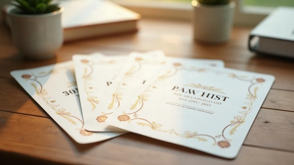
When someone designs wedding invitations, they agonise over the look and feel. Why? Because the invitation doesn’t just convey information; it sets the tone for the whole experience. It says, “This matters. You matter. We’d love you to be there. ”
Church bulletin design should work the same way. Instead of feeling like a shopping receipt or a laundry list, it should feel like an intentional invitation into something precious and communal. Paper choice, spacing, hierarchy, and imagery all contribute to that tone.
This doesn’t mean it has to be ornate or expensive. In fact, some of the most effective bulletins are visually very simple. The key is that they feel purposeful and inviting rather than institutional and transactional. Clear headings, consistent styles, and a gentle visual rhythm can make even basic black-and-white bulletins feel human and welcoming.
If you want engagement, your bulletin has to look like an invitation—not an institution.
Dan Nichols
Consistent Branding: The Secret to Church Bulletin Design That Unites Your Mission
One of the most overlooked aspects of church bulletin design is branding—not in the corporate sense, but in the biblical sense of shared identity, story, and mission.
When your website, social media, signage, slides, and bulletins all look and feel like they belong together, you tell a coherent story: “This is who we are. This is what we’re about. This is how you can join in. ” When every channel looks different, people feel disoriented and disconnected, even if your theology and teaching are sound.
Consistent church branding is not vanity; it’s clarity. It helps your church family recognise your voice, remember your vision, and trust your communication. The bulletin is a weekly touchpoint where that consistency can either be reinforced or undermined.
Case Study: Walton Evangelical Church’s Bulletin Transformation
At Walton Evangelical Church, I worked with the team to bring every piece of communication under a single, clear visual vision rooted in their mission: to live to love, serve, and share Jesus.
- Unified messaging across web, print, and bulletins
- Bulletins linked visually and verbally to church vision
- Measurable boost in participation and event turnout

The website, social media graphics, printed materials, and weekly bulletin all began to use the same core colours, fonts, logo, and key phrases. The bulletin became a weekly reminder of the church’s identity and calling, not just a list of what was on.
Over time, members started echoing the language of the vision in conversation because they were seeing it everywhere. Events that aligned with that vision were easier to promote, because the bulletin visually reinforced how they fitted into the bigger picture. People didn’t just attend events; they understood why they mattered.
That’s the power of consistent branding within church bulletin design: it turns isolated announcements into a connected narrative of discipleship and mission.
The Clarity Code: My 2-Step Framework for Irresistible Church Bulletin Design
When churches ask me where to start with church bulletin design, I come back to two words: clarity and consistency. If you get those right, everything else—from colours to icons to print quality—becomes much easier to decide.
I use a simple two-step framework for every bulletin I design. It’s not complicated, but it is ruthless. And it’s that ruthlessness that creates the sense of peace, focus, and welcome that most people are craving when they walk into a service.
Step 1: Clarity Is King—Minimize Noise, Maximize Message

Clarity starts with the hard question: “What actually matters this week?” Not everything can be the main thing. If every notice feels urgent, nothing truly important stands out. Good church bulletin design forces leadership teams to prioritise instead of just accumulate.
Practically, that means using clear hierarchy: a small number of primary items given prominent space, with secondary items structured beneath them. It means using headings, subheadings, and white space to guide the eye. It means cutting jargon, abbreviations, and insider language that confuse newcomers and quietly exclude those still finding their way in.
Clarity is also about readability. Simple, legible fonts. Adequate line spacing. Contrast between text and background. Plenty of margin. These are not aesthetic niceties; they are accessibility issues, especially for older members or those with visual processing challenges. A beautiful design that can’t be easily read is a failed design.
I aim for bulletins that can be scanned in 10–20 seconds. In that timeframe, a visitor should be able to answer three questions: What is this church about? Where could I start if I’m new? What one or two things are clearly important this week?
Step 2: Consistency Over Chaos—Branding That Binds Your Church Family
The second step in my framework is consistency. If clarity answers “What matters this week?”, consistency answers “Who are we every week?”
Consistency in church bulletin design means using the same visual language over time: the same set of typefaces, the same core colours, the same style of icons or imagery, the same placement for recurring sections. It lowers the cognitive load for your congregation. They learn, almost unconsciously, where to look for what they need.
For example, you might always place “New Here?” information in the same spot, with the same background colour, each week. You might always highlight your main church vision statement in a particular style. Regulars learn the pattern, and newcomers benefit from a calm, predictable structure rather than a constantly changing layout.
Clear, consistent, Christ-centered messages build community—every bulletin, every week.
Dan Nichols
Over time, this consistency does more than tidy up your visuals. It builds trust. People feel, often subconsciously, that your church is stable, thoughtful, and reliable. That sense of reliability makes it easier for them to take the next step—join a group, serve in a ministry, invite a friend—because they know what to expect.
Bulletin FAQs: Your Design Questions Answered
- How often should you update your church bulletin design?
- What are the best tools for modern church bulletin design?
- How can bulletins support both in-person and digital ministry?

How often should you update your church bulletin design?
I recommend keeping your core church bulletin design stable for at least 12–18 months, with only minor tweaks along the way. That window is long enough for your congregation to become familiar with the layout and recognise key sections instantly, which is vital for clarity and ease of use. When you do refresh the design, treat it like a small “rebrand”: review your church vision, key ministries, and audiences so the new design matches where your church is now—not where it was five years ago.
What are the best tools for modern church bulletin design?
The best tools are the ones your team can actually use consistently. For many churches, Canva or similar browser-based tools are ideal because they offer templates, shared brand kits, and an easy learning curve. If you have access to a designer, professional tools like Adobe InDesign or Affinity Publisher give you finer control for complex layouts. The non-negotiable is this: whatever tool you choose must support consistent styles—brand colours, fonts, and layouts—so your bulletin doesn’t look different every time a new volunteer edits it.
How can bulletins support both in-person and digital ministry?
A well-designed bulletin works as a bridge between the physical and digital life of your church. Short, clear notices can point people to QR codes, short links, or your website for full details, keeping the printed design uncluttered while still connecting to deeper online content. You can also design your bulletin layout so it exports cleanly to PDF or images for email and social sharing, making the same clear, consistent communication accessible to those watching online, away on holiday, or unable to attend in person.
Key Takeaways: Church Bulletin Design That Invites, Engages, and Connects

- Stop treating bulletins as information dumps—start designing invitations.
- Consistent branding is the foundation of authentic community.
- Clarity in design and message leads to genuine engagement.
Church bulletin design is not a side project for the “creative types. ” It is a weekly opportunity to serve people’s attention, remove friction for newcomers, and keep your whole church family focused on what truly matters.
If you view your bulletin as a ministry tool rather than a notice board, you’ll start asking better questions: Are we inviting people into community or just informing them about activity? Are we reinforcing our vision or just listing our schedule? Are we making it easier or harder for people to find their next step?
Ready to Transform Your Church’s Communication?
If you’re ready to move beyond cluttered notices and unlock church bulletin design that truly supports your mission, I’d love to help you get there. Together we can clarify your message, unify your branding, and create bulletins that feel more like invitations than paperwork.
Visit churchgraphicdesign.co.uk to explore how I support churches across the UK with visual communication and church bulletin design. If you want to understand how I handle commercial relationships, you can read the full Business Interest Disclaimer here: Business Interest Disclaimer.
As you continue to refine your church’s communication, remember that every design choice is an opportunity to reinforce your shared beliefs and mission. If you’re interested in exploring the foundational principles that shape effective church messaging, take a deeper look at the core beliefs that guide our approach. Understanding and communicating what your church stands for is the cornerstone of building trust, unity, and lasting engagement—both in your bulletins and beyond.





Write A Comment