


Most churches spend hours praying, planning, and preparing their outreach message—then give the design of that message zero budget and almost no thought.
That’s the quiet tragedy I see again and again.
In a digital world flooded with high-quality visuals, motion graphics, and endlessly scrollable content, a church flyer thrown together in Word, or a pixelated social post with three different fonts, simply doesn’t stand a chance. The Gospel hasn’t changed, but the visual environment we’re communicating into has completely transformed.
My mission is straightforward: help churches treat their packaging design mission with the same seriousness as their preaching mission—because the two are now inseparable in effective outreach.
When I talk about a packaging design mission, I’m not talking about making things “pretty” for the sake of it. I’m talking about a clear, intentional commitment to how your church presents the Gospel visually and consistently, across every touchpoint—from the poster on the lamppost to the reel in someone’s Instagram feed.
When churches ignore this, they don’t just miss a branding opportunity. They risk their message never being seen, never being understood, and never being acted on.

The Invisible Barrier: Overcoming the Outreach Design Budget Trap
If you don’t invest in how your message is seen, don’t be surprised when it isn’t.
Dan Nichols
There’s a pervasive misconception in church life that design is a luxury, not a ministry tool. I regularly see churches allocate generous budgets for guest speakers, food, venue hire, and tech—then expect the outreach materials that promote all of that to somehow emerge for free, at the last minute, from a stressed volunteer with no design training.
This is the outreach design budget trap: the belief that the message is so important that the packaging doesn’t matter. The intention is noble; the outcome is disastrous. In practice, when churches put no budget or planning into design, they’re unintentionally declaring that how people first encounter that message is irrelevant.
But in a digital, visually saturated culture, the first encounter is usually visual. People see before they listen. They scan before they read. They judge credibility, care, and professionalism in milliseconds based on how something looks. That’s not worldliness; that’s how human cognition works.
If your packaging design mission is “whatever we can throw together quickly,” your mission is already in trouble.
For churches seeking to align their visual identity with their core beliefs, it’s crucial to ensure that every design decision reflects the heart of your message. Exploring how your foundational beliefs shape your church’s visual communication can help you create outreach materials that are both authentic and impactful.
Why a Packaging Design Mission Is Essential in the Digital Church Era
We now do church outreach in an environment where people are continually exposed to world-class design from brands, creators, and causes. Whether your church likes it or not, you’re competing in the same feed as Nike, Netflix, and the latest viral creator content.
- Digital media is flooded with creative, engaging posts—unbranded church outreach gets overlooked. When someone is scrolling, they’re not thinking, “I’ll give this church the benefit of the doubt because it’s about God.” They’re subconsciously filtering: “Is this relevant? Is this trustworthy? Is this worth my attention?” Weak visual design gets dismissed before the Gospel message has a chance.
- Consistent design = instant recognition and message clarity. When your church’s social posts, posters, banners, and invites share a clear, consistent look and feel, people start to recognise them at a glance. That familiarity builds trust and enables your message to land faster and more clearly.
- A clear packaging design mission attracts attention; a lack of it repels. Thought-through design doesn’t just “look nice”—it guides the eye, highlights the key message, and makes the next step obvious. Random, unplanned design does the opposite: it confuses, feels amateur, and quietly pushes people away.

Your Gospel message deserves the same creative excellence as anything competing for attention online.
Dan Nichols
When I work with churches on their packaging design mission, I’m not trying to make them look like a tech startup. I’m helping them remove visual barriers so that what truly matters—Christ, hope, community, discipleship—can actually be seen and responded to.
The Consistency Advantage: Real Church Wins with Branding
How Walton Evangelical Church Turned Consistent Packaging into Community Impact
One of the clearest examples of a simple but effective packaging design mission in action is Walton Evangelical Church, here in the UK. They didn’t start with a huge budget or a full-time design team. What they did have was a conviction: if the message matters, the way we present it must be intentional and consistent.
- Branded posters, social posts, and event materials built one recognizable identity. Instead of each event having its own random look, we developed a consistent set of colours, typography, and layout approaches that tied everything back to the church’s core identity. Whether it was a kids’ event or a carol service, there was a visual thread that said, “This is us.”
- Community members knew instantly: “This is our church’s message.” Over time, people in the community could spot a Walton Evangelical Church poster from across the street or recognise a social graphic while scrolling. That visual familiarity meant the mental barrier to engaging with the content dropped significantly.
- Result: Outreach efforts gained trust, clarity, and measurable engagement lift. When the branding became consistent, the church saw clearer responses to events, better attendance, and more people actually knowing which church was inviting them. The message wasn’t lost in a sea of generic community noise—it was anchored to a recognisable identity.
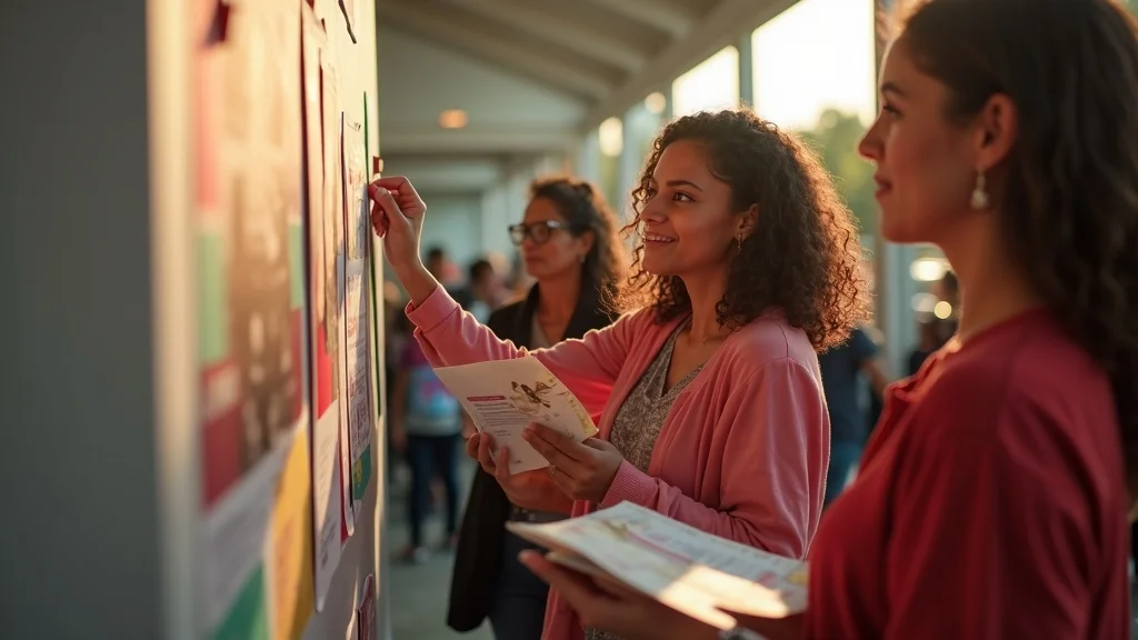
Consistency isn’t style for style’s sake. It’s how your story becomes unforgettable.
Dan Nichols
This is the heart of a strong packaging design mission for churches: create visual consistency so people can track with the story God is telling through your ministry. Otherwise, every new design feels like starting from zero in your community’s mind.
Your Simple, Consistent System: The Mission-Driven Design Framework
The Three Principles: Simple, Consistent, Action-Oriented
You don’t need an in-house creative agency to have a powerful packaging design mission. You need a simple framework that volunteers, staff, and leaders can all understand and apply. I reduce it to three core principles:
- Keep messaging minimal—don’t overcomplicate. Most church outreach materials try to say too much. Multiple Bible verses, paragraphs of copy, three event titles, four logos, and a map squeezed into an A5 flyer is visual overload. The clearer the message, the more likely someone will actually read and respond. One main headline, one key benefit, one clear next step.
- Maintain uniform branding across every channel. Whether it’s a poster in the high street, a WhatsApp image, or an Instagram story, the core elements should feel obviously connected: same colour palette, typography, and overall style. That uniformity doesn’t limit creativity; it focuses it. It ensures every piece reinforces your church’s identity instead of fragmenting it.
- Always provide a clear next step—website, event, or contact link. A beautifully designed invitation that doesn’t tell people what to do next is a missed opportunity. Every piece of outreach should make the next action unmissable: visit this page, sign up here, come at this time, scan this code. Clarity in your calls to action is a core part of your packaging design mission.

Pro Tip: Make ‘Next Step’ Calls to Action Unmissable
If I could get churches to do one simple thing with their packaging design mission, it would be this: make the next step the hero of the design.
- Every design should clearly say: here’s how to connect (visit, RSVP, learn more). Practically, that might mean a bold “Visit churchwebsite.org/alpha” on every invite, a simple “Join us Sundays 10:30am” clearly visible on every series graphic, or a scannable QR code that leads to a landing page specifically for that outreach.
- Align the call to action visually and verbally with your church’s mission. If your mission is “helping people find and follow Jesus,” your visual design and your CTA language should echo that tone—warm, invitational, clear, not corporate or vague. The way you invite should feel like an extension of the kind of community you are.
When someone sees your design, they shouldn’t need to hunt for what to do next. Your packaging design mission is working when the next step feels obvious, natural, and easy to take.
Quick Guide: Avoiding Common Church Design Mission Mistakes
Most of the design problems I see in church outreach repeat the same few patterns. Fix these, and you immediately strengthen your packaging design mission:
- No budget? You’re missing the chance to amplify your Gospel call. Refusing to allocate any budget to design is effectively deciding that the church’s most public-facing communication will be the weakest link in your outreach. Even a modest, planned design budget—used wisely for templates, occasional professional support, or design tools—can drastically improve impact.
- Random design choices fracture trust and dilute your message. When every event looks like it belongs to a different organisation, people subconsciously perceive instability or disorganisation. Consistently branded design signals care, reliability, and intention—qualities people deeply value when deciding whether to engage with a church.
- Thinking “good enough” design is enough—audiences simply scroll by. “Good enough” typically means “no one here hates it,” not “this will catch attention in a competitive feed.” In a digital landscape where people are used to polished design, below-average visuals communicate that your message is less important, even if that’s the opposite of what you believe.
None of this is about impressing people for the sake of ego. It’s about removing unnecessary visual reasons for them to ignore the very message you long for them to hear.
Key Takeaways: Craft a Packaging Design Mission That Converts
If you want your outreach to cut through the noise, not just exist in it, your church needs a conscious, shared packaging design mission. These are the essentials I come back to again and again:
- Treat your message like God’s story deserves: with intentional, mission-driven design. The Gospel is the most important message your community will ever hear. How you visually present it should reflect that importance—not with extravagance, but with intentionality, clarity, and care.
- Consistency isn’t optional if you want recall and engagement. The more consistently you show up visually, the faster people recognise you, trust you, and understand what you’re about. Inconsistent design forces people to re-learn who you are every time they see something from you.
- Every piece should invite action—make responding easy and obvious. A strong packaging design mission always asks: what do we want someone to do next, and have we made that step visually and verbally unmistakable? That’s how design stops being decoration and becomes a real ministry tool.

Ready to Transform Your Church’s Visual Impact?
Simple, consistent design multiplies your outreach power.
Dan Nichols
If you recognise that your church has a heart for outreach but a gap in how that heart is visually expressed, this is the moment to define your packaging design mission.
Start small but intentional: decide on a core visual identity, reduce your messaging to what truly matters, and make your calls to action unmissable on every piece of communication. Then, consider where a bit of outside help could accelerate that process—whether that’s commissioning a basic brand kit, getting templates created for your key channels, or partnering on a specific outreach campaign.
My work at Church Graphic Design exists to walk alongside churches in exactly this space—helping leaders move from “we just throw things together” to “our visuals clearly reflect the message and mission God has given us. ”
If you’re ready to clarify and strengthen your church’s packaging design mission, reach out, and let’s explore what’s possible together.
As you consider the next steps for your church’s visual strategy, remember that effective design is always rooted in authentic belief. To deepen your understanding of how your church’s core convictions can inform every aspect of your outreach—from branding to messaging—take a look at our foundational approach to faith and communication. By aligning your design mission with what you truly believe, you’ll not only create more compelling visuals but also foster a deeper connection with your community. Let your church’s story shine through every detail, and watch as your message resonates more powerfully than ever before.
Author
Dan Nichols BSc
Founder & Creative Designer, Church Graphic Design, Chesterfield, UK
Email: dan@churchgraphicdesign.co.uk
Website: churchgraphicdesign.co.uk
Editorial Collaboration
This article was developed in collaboration with:
Ken Johnstone MBA BSc – Executive Editor, DYLBO Digital Media & Biblical Living Unlocked
Email: ken@dylbo.co.uk
To further enhance your understanding of the importance of a cohesive packaging design mission, consider exploring the following resources:
-
“Mission, Vision, and Promises” by Elopak provides insights into how a clear mission and vision can guide packaging design to align with brand values and sustainability goals. (elopak.com)
-
“Our Mission” by Studio One Eleven discusses strategies for using packaging design to increase sales, reduce costs, and improve productivity, emphasizing the role of design in building a brand. (packagemoreprofit.com)
These resources offer valuable perspectives on aligning packaging design with your brand’s mission to create a consistent and impactful visual identity.




Write A Comment