cropper
update

Biblical Living Unlocked

Logo - Biblical living unlocked
update
  • Home
  • Categories
    • Biblical Parenting
    • Parenting Tips
    • Family Fellowship
    • Bible Teaching
    • Apologetics
    • Community Stories
    • Youth Focus
    • International
    • Walton Evangelical Church
    • Salt Church Mar Menor
    • Salt Church Los Montesinos
    • John Piper
    • News & Offers
  • Ken on Facebook
    update
  • update
  • update
  • update
  • update
  • update
  • update
June 13.2026
1 Minute Read

Struggling with diy church graphic design problems? Here's Help

If you’re anything like the churches I work with, your biggest design “problem” isn’t effort or intention. You care deeply. You love your congregation. You want your community to meet Jesus.

The real problem is this: most DIY church graphic design problems begin the moment everything becomes inward focused.

Graphics get created for “our people,” not for the people who haven’t yet walked through the doors. Notices, sermon slides, social posts, and logos quietly start speaking an insider language—comfortable for the congregation, almost invisible to the community.

That inward focus is subtle, but it’s deadly for outreach.

My work with churches across the UK has shown me one thing clearly: when visuals don’t connect with your neighbors—the people in your mission field—your evangelism efforts are already starting with a handicap.

In this article, I want to walk you through the most common DIY church graphic design problems I see, how they hold your church back, and how a simple outward-focused audit (with or without professional help) can radically realign your message with your mission.

Frustrated church volunteer working on unfinished DIY church graphics at a cluttered desk in a small church office

When your graphics make sense to your members but mean nothing to your neighbors, your outreach is already in trouble.

Dan Nichols

Why DIY Church Graphic Design Often Misses the Mark (And How It Holds You Back)

Most DIY church graphic design problems don’t come from laziness or lack of faith; they come from proximity. When I’m inside a church community, involved in services, midweek groups, and leadership meetings, it’s very easy to design only for the people sitting in front of me.

I know their language. I know their preferences. I know that “AGM,” “prayer and praise evening,” or “Bring and Share” make perfect sense to them. The problem is that your neighbors—your actual mission field—often have no idea what any of that means, or why they should care.

So the designs end up looking like they belong to the church, but not necessarily like they’re for the community.

The Community Blind Spot: How Inward-Focused Design Stalls Outreach

The biggest blind spot I see in DIY church graphic design is this: the audience is assumed, not examined. Visuals are built around the congregation’s habits, not the community’s needs. That’s where outreach quietly stalls.

  • DIY efforts often speak only to existing members. A poster that says “Join us for our series in Romans” might excite regulars who already understand the context. But for someone outside the church, it’s just religious jargon with no clear benefit or invitation.
  • Visuals reflect internal culture, not community needs. Churches often use imagery and language that feels familiar to them—traditional fonts, insider phrases, certain color palettes—without asking whether the people in their town, estate, or city would ever naturally engage with that.
  • Outreach suffers as designs fail to connect with newcomers. If a newcomer can’t work out what an event is, who it’s for, or why it matters within two or three seconds of seeing a graphic, they will simply ignore it. Not because they’re hostile to church, but because they’re overwhelmed with information already.

DIY church graphic design problems become serious evangelism problems when everything is optimized for the people already “in,” instead of those still “out” who most need to see and understand the good news of Jesus.

Evangelism, at its core, is outward-facing. It’s about stepping into someone else’s world, not asking them to adapt to ours first. Your graphics need to do the same.

One practical way to ensure your visuals are truly outward-focused is to revisit the foundational beliefs and values that shape your church’s identity. By aligning your graphics with what your church stands for, you can create designs that resonate both internally and externally. For a deeper look at how core beliefs inform effective communication, explore how your church’s statement of faith can guide your design choices.

Turning the Tide: The Power of Community-Centered Visual Storytelling

Once a church realizes that its visuals are overly inward and start to shift toward the community, everything changes. The question moves from, “Do our people like this?” to, “Does this help our neighbors see and understand Jesus more clearly?”

That’s the heart of community-centered visual storytelling: using design to build a bridge between your message and your mission field.

Diverse congregation interacting with bright, welcoming church signage in a modern church lobby

Church graphics must bridge the gap between your message and your mission field—or they become just more religious wallpaper.

Dan Nichols

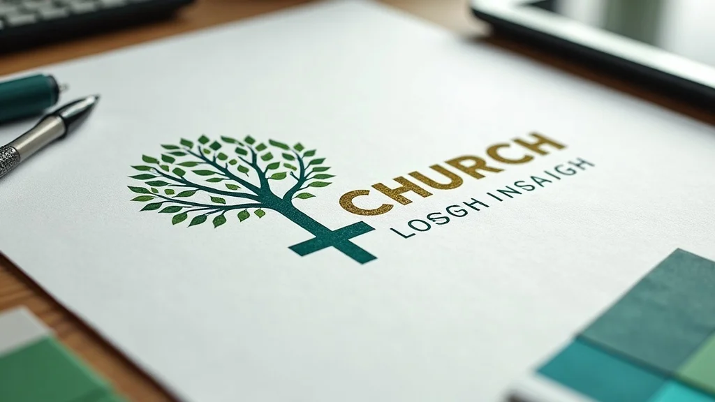
Epiphany Moment: The Walton Evangelical Church Logo That Connects

One example that continues to encourage me is Walton Evangelical Church. Their logo and branding do far more than just “look nice. ” They actually communicate who they are and what they’re about in a way that makes sense to people both inside and outside the church.

  • Flourishing tree + cross: growth, faith, and mission visually united. At first glance, the logo appears as a flourishing tree—something universally understood as a symbol of life, health, and growth. But look closer and the trunk and branches form a cross at the center. It quietly but clearly says, “Real life and growth come from Jesus.”
  • Mission statement reflected in every design choice. The church’s mission is “living to love, serve, and share Jesus.” The logo, color palette, and overall branding reinforce that: life, flourishing, service, Christ at the center. The visuals and the mission are speaking the same language.
  • Result: clear, consistent outreach that resonates beyond church walls. That kind of design can appear on a banner in the town center, on social media, or on printed invitations, and it still makes sense. Someone with no church background can feel that this is about life, growth, and something centered on Jesus, even before they read a single line of text.

Contemporary church logo concept showing a tree interwoven with a cross on a designer’s workspace

That’s what happens when a church stops thinking, “How do we keep everyone happy internally?” and starts asking, “How do we visually live out our mission in a way our community can immediately grasp?” It’s a shift from decoration to communication.

Design With Purpose: The “Outward Focus Audit” Framework

Most churches don’t need to throw everything away and start again. What they need is an honest look at where their graphics are pointing: inward or outward. I use a simple framework that any church can apply, whether they’re working entirely DIY or alongside a professional designer.

Audit your visuals: do they speak to your neighbors—or just your members?

Dan Nichols

Step-by-Step: How to Realign Your Church’s Graphics for True Outreach

This “Outward Focus Audit” is a practical way to turn vague DIY church graphic design problems into specific, solvable issues.

  1. Examine your current logo and branding materials.
    Gather your logo, notice sheets, sermon graphics, social media posts, website headers, and event flyers. Spread them out—physically or digitally. Ask: “If I knew nothing about church, what would I think this place is about?” Be brutally honest.
  2. Revisit your church’s mission and vision.
    Write your mission and vision in front of you in clear, everyday language. Not a paragraph for a policy document—one or two sentences you’d use if someone in a café asked, “So what’s your church actually about?” That’s the message your visuals must reflect.
  3. Assess community demographics and unique needs.
    Who actually lives around you? Young families? Retirees? Students? A mix of cultures? What are the main pressures: cost of living, isolation, mental health, family breakdown? You’re not designing for an abstract “audience”; you’re designing for real people on real streets with real struggles.
  4. Identify gaps between message, mission, and visuals.
    Now compare. Does a stranger looking at your graphics see anything that connects to your mission and the needs of your community? Or do they just see dates, times, and churchy language? This is where you will spot your most important DIY church graphic design problems.
  5. Seek professional insights for a transformation.
    Once you’ve done all you can, it can be incredibly helpful to invite an outside perspective—someone who understands both design and church mission. Sometimes what feels “fine” internally is clearly confusing externally, and a fresh pair of eyes can accelerate the transformation.

Church leaders and community members in a collaborative design meeting reviewing graphics together

The goal isn’t to make your church look like a trendy brand. The goal is to remove every unnecessary barrier between your community and the message of Jesus by making your visuals clear, welcoming, and aligned with your mission.

Quick Wins: Actionable Tips for Churches Facing DIY Design Challenges

While a full rebrand or deep audit can be powerful, I also know church life is full and volunteers are stretched. So here are some quick, realistic changes that can immediately reduce your DIY church graphic design problems and strengthen your outreach.

  • Prioritize clarity and community relevance in every graphic. Before you finalize anything, ask: “Would my neighbor understand this in 3 seconds?” Keep text simple. Explain Christian terms in plain language. Use imagery that actually connects with everyday life in your town or city, not just generic religious pictures.
  • Involve outreach leaders in the design process. Don’t let graphics sit only in the hands of whoever “knows PowerPoint” or “enjoys Canva.” Involve the people who are actually out in the community—those running youth work, food banks, CAP courses, or street outreach. They will quickly tell you whether something will land well or fall flat.
  • Regularly review and update visuals for current effectiveness. An old logo or poster that “we’ve always used” might be quietly working against you. Schedule a simple review every few months: what’s working, what’s being ignored, what people ask questions about, what no one responds to. Treat your visuals as part of your evangelism strategy, not as a static decoration.

Church outreach volunteers updating bulletin boards with fresh, engaging graphics in a bright hallway

Even these small steps can turn confusing, inward-looking materials into clearer, more community-friendly visuals. They don’t remove the need for expertise, but they massively improve the impact of what you’re already doing.

Key Takeaways: Elevate Your Church’s Message with Strategic Visuals

When I strip it all back, the core issue behind most DIY church graphic design problems is misalignment: a strong gospel message hidden behind weak, inward-facing visuals.

  • Outward-focused design fuels effective evangelism. If the good news of Jesus is for your town, estate, or city, your graphics must speak to those people first. Design is not a cosmetic extra; it’s part of how you communicate the gospel clearly.
  • Symbolism and mission alignment make branding memorable. A logo like Walton Evangelical Church’s tree-cross combination works because it brings together who they are, what they believe, and what they want for their community. That kind of clarity lodges in people’s minds and hearts.
  • Periodic audits prevent costly outreach missteps. Without regular review, you can spend years promoting events with graphics that simply don’t connect with those you hope to reach. A simple outward focus audit can save time, energy, and missed opportunities.

The good news is that none of this requires you to become a world-class designer. It does require you to become deeply honest about who you’re actually designing for—and to be willing to adjust.

Ready to Transform Your Church’s Graphics?

If you’ve read this and realized that your visuals are mostly speaking to the congregation rather than the community, you’re not alone. I see it everywhere, and it’s entirely fixable.

A thoughtful logo, clear branding, and community-aware graphics can’t replace prayer, preaching, or personal evangelism—but they can remove unnecessary confusion and help your message land where it’s meant to: in the lives of your neighbors.

If you’d like a fresh pair of eyes on your current materials, I’d love to help. I regularly work with churches to:

  • Audit existing logos, print materials, and digital graphics
  • Clarify mission, vision, and community focus from a design perspective
  • Develop branding and visuals that genuinely serve outreach and evangelism

You don’t have to stay stuck in DIY church graphic design problems. With a clear mission, an outward focus, and the right support, your visuals can become a powerful extension of your calling to love, serve, and share Jesus in your community.

Next step: Gather your current graphics, write down your mission in one sentence, and do your own mini “Outward Focus Audit. ” If you’d like help turning that into a real strategy, get in touch with me at Church Graphic Design and let’s explore what’s possible for your church.

If you’re ready to take your church’s communication to the next level, consider how your beliefs and values can shape every aspect of your outreach—from your graphics to your conversations. By grounding your visual identity in what you truly believe, you’ll not only clarify your message but also build trust with your wider community. For further inspiration on integrating faith and design, discover how a clear statement of faith can become the foundation for all your church’s communications. Let your next step be a bold one—rooted in purpose, and designed for real impact.

When tackling DIY church graphic design challenges, it’s essential to recognize common pitfalls and implement effective strategies to enhance your outreach efforts. The article “5 Common Mistakes Church Designers Make (and How to Fix Them Fast)” highlights frequent errors such as designing without a clear purpose, inconsistent styles, and cluttered layouts, offering practical solutions to address these issues. (churchcanvas.ai) Similarly, “The 7 Design Mistakes You Might Be Making in Your Church Graphics” emphasizes the importance of limiting font usage and maintaining consistency to avoid overwhelming your audience. (churchtechtoday.com) By understanding these common mistakes and applying the suggested remedies, you can create more effective and engaging church graphics that resonate with both your congregation and the broader community.

News & Offers

2 Views

0 Comments

Write A Comment

*
*
Please complete the captcha to submit your comment.
Related Posts All Posts
06.15.2026

Healthcare Crisis: Will New Health Secretary James Murray Snub Darlington Nurses?

Update New Health Secretary Faces Backlash Over Nurse Engagement Newly appointed Health Secretary James Murray is under fire for failing to uphold his predecessor's promise to meet with Darlington nurses involved in a significant NHS case concerning single-sex spaces. This situation came to light following a crucial ruling earlier in 2026, which established that the County Durham and Darlington NHS Trust unlawfully discriminated against female staff by mandating shared female changing spaces with individuals identifying as women. A Commitment That Was Set Aside Former Health Secretary Wes Streeting had recognized the serious implications of the nurses' concerns, suggesting a meeting after the anticipated release of the Equality and Human Rights Commission (EHRC) Code of Practice. However, reports indicate that James Murray, who assumed office just last month, has not committed to this meeting, raising doubts about the future dialogue intended to discuss safety and compliance with the recent Supreme Court ruling concerning biological sex in healthcare settings. Chair of the Darlington Nursing Union, Bethany Hutchison, expressed disappointment that the commitment from Streeting seems to have been forgotten. “We are not engaging in theoretical discussions; our appeal is about real concerns impacting frontline staff,” Hutchison stated. She urged the Health Secretary to adhere to the promises made and to prioritize the dignity and safety of nurses as a fundamental issue. The Evolving Stance on Gender and Healthcare James Murray’s recent comments reflect a noticeable shift in his approach to gender identity and healthcare. Previously, he stated, “I believe that trans women are women,” but following the Supreme Court's April 2025 ruling—which clarified the definition of “sex” under the Equality Act—Murray has modified his rhetoric. During a June BBC Radio 4 interview, he noted that he would no longer use the phrase “trans women are women,” underscoring the law's clarification on single-sex spaces within the NHS as fundamentally protective of biological sex. The Political Underpinnings of Health Policies The controversy surrounding the treatment of nurses and the commitment of health officials highlights a broader issue within the NHS—political inconsistencies and the urgent need for health justice. The NHS, as conceived by founding Health Minister Aneurin Bevan in 1948, is predicated on principles of comprehensiveness and equity, aiming for universal access without financial constraint. Yet, the current climate shows a tendency towards merely reactive policy-making that fails to address the root causes of health disparities. Voices from the Healthcare Community Andrea Williams of the Christian Legal Centre echoed the nurses' calls, stressing that the Ministry of Health must not overlook adherence to the law regarding single-sex spaces, framing the sector's responsiveness as crucial to restoring confidence among healthcare workers and patients alike. With public trust waning, it becomes essential for the government to engage transparently with frontline staff and uphold principles of dignity and safety in healthcare. Challenges and Opportunities Ahead for Murray As James Murray navigates his role, he faces a series of pressing challenges within the NHS, including staffing shortages, pay grievances, and systemic inequities that impact patient care. He must prioritize effective engagement with nursing unions and support the clarification of healthcare regulations, setting a precedent for more profound transformations in the health system. The time is ripe for Murray to adopt a health justice framework that endorses the rights of all staff while actively promoting clarity and trust in the UK's healthcare system. Each decision he makes could be a step towards either maintaining the current cycle of challenges or fostering a more robust, equitable, and dignified NHS for both healthcare workers and patients. Following Through: The Call for Action As the ongoing debacle regarding the engagement with Darlington nurses unfolds, it raises an important question: Will Murray choose collaboration over isolation to ensure that all members of the NHS feel respected, safe, and listened to? The stakes are high as nurses advocate for their rights, and the Health Secretary has the power to influence systemic change by actively participating in dialogues that could reshape the future of healthcare in the UK.

06.11.2026

How Religion Data Shapes the Discussion on Grooming Gangs in the UK

Update Understanding the Role of Religion in the Grooming Gangs Discourse The issue of grooming gangs in the UK has become a sensitive topic, raising complex discussions around the intersections of religion, ethnicity, and cultural attitudes toward child exploitation. As several inquiries delve into these matters, it’s crucial to understand how the data linking religion to these crimes might influence public perception and policy. Why It’s Important to Investigate Religious Contexts An independent inquiry that investigates the roles of religion and culture in addressing grooming gangs is currently underway. The National Secular Society has endorsed this inquiry, emphasizing the need to examine how these factors affect responses to group-based sexual exploitation. Notably, this concern arises from evidence showing that certain offenders belong to specific ethnic and religious backgrounds, leading to significant public debates about the implications of such associations. As reported, many individuals involved in these crimes were of Pakistani and/or Muslim heritage. However, it’s vital to stress that attributing such heinous acts solely to cultural or religious identities can obscure a broader understanding of the problem, which is rooted in various societal issues, including gender dynamics, socio-economic status, and systemic failures of law enforcement and child protection. Addressing Misconceptions About Islam and Grooming Gangs Many voices in society have condemned the actions of grooming gangs, yet these criticisms often lead to broader, unfounded associations between Islam and sexual abuse. Critics argue that the tendency to label grooming gangs as religiously motivated is incorrect; Islam fundamentally promotes respect for women, opposes exploitation, and upholds justice. As highlighted in the community responses surrounding the infamous Rotherham case, many Muslims vehemently rejected any suggestion that their faith condones such behaviors. “There is nothing in the Pakistani or Muslim culture or Islamic faith that condones such actions,” articulated Muhbeen Hussain, highlighting the overwhelming consensus within numerous Muslim communities against exploitation. Simply blaming an entire culture or religion for the misdeeds of individuals detracts from the real societal solutions needed to address child exploitation. The Ripple Effect of Inadequate Responses Authorities have faced criticism about their responses to grooming gang incidents, often accused of prioritizing community relations over justice due to fears of racial backlash. The lack of openness in these discussions can leave victims feeling alienated and discouraged from coming forward. This silence perpetuates cycles of trauma and injustice. Simultaneously, it invites harmful rhetoric that undermines interfaith dialogue and encourages division. Investigations must place victims’ voices at the forefront, ensuring that societal reform addresses systemic failures without targeting specific communities unfairly. Fostering Safe Environments Through Compassion and Truth As communities work through these difficult conversations, it’s essential to approach the dialogue with a spirit of hope and compassion. Understanding the interplay of cultural, social, and religious contexts surrounding grooming gangs presents an opportunity for unity. Emphasizing shared values, such as protecting life and promoting family, is vital for healing and finding solutions. Additionally, engaging religious communities in the fight against grooming and exploitation can foster collaborative efforts to protect vulnerable individuals. By encouraging interfaith conversations, society can promote mutual respect and understanding while actively working to prevent the exploitation of children. The Path Forward: Balancing Dialogue and Action Challenges remain in navigating the complexities of addressing grooming gangs and associated societal issues. Nevertheless, the paramount importance lies in collectively addressing exploitation and safeguarding vulnerable populations, regardless of background. This calls for an honest and open dialogue about the societal roots of these crimes, paired with practical action plans effectively safeguarding our communities. Understanding religion within this framework can illuminate critical paths toward justice and healing. It involves recognizing and combatting the potential misuse of religious narratives to undermine collective efforts against child exploitation. By focusing on shared hopes for justice and protection, we can foster a more inclusive and resilient society. In summary, the involvement of religion in discussions surrounding grooming gangs is a multi-faceted issue that merits careful examination and empathetic dialogue. Through these lenses, we can work together to defend freedom and create safe environments where all are protected.

06.07.2026

Master Digital-First Church Communications for Social & Mobile

Most churches still treat screens like digital noticeboards. Someone opens PowerPoint on a Saturday night, pastes in some text, adds a gradient background, and hopes for the best. On Sunday, the same generic graphics get screenshot for Instagram, cropped for YouTube, and somehow repurposed for the website. That isn’t digital-first church communications: designing for social, mobile, and Sunday screens at once. That’s survival mode. When I design for churches, I’m not thinking “What will look nice on the projector?” I’m thinking, “How does this slide, this thumbnail, this social post actively serve the mission? How does it help real people hear, understand, and respond to the gospel in the spaces they actually live—on their phones, on YouTube, and in the room on a Sunday?” Digital-first church communications isn’t about being trendy. It’s about treating your visuals as ministry tools, not decorative extras. It’s how you take the same core message and make it genuinely effective on mobile, on social media, and on Sunday screens—without burning out your team or blowing your budget. Why Copy-Paste Church Design Fails: Breaking the One-Size-Fits-All Trap When most churches hear “multi-platform” they quietly panic. The instinctive response is: “We don’t have time for that. Let’s just make one design and use it everywhere. ” The Sunday slide becomes the Instagram square. The sermon title slide becomes the YouTube thumbnail. The notice graphic becomes the Facebook post. On the surface, this feels efficient. In reality, it’s the biggest reason digital-first church communications fails. Each platform has a different context, culture, and consumption pattern. What works on a large screen at the back of a hall does not automatically work as a tiny image on a phone in a noisy train carriage. On Sunday, your congregation is (usually) focused, and your slides exist to support live preaching and worship. On Instagram, you have a split second to capture attention in a scrolling feed. On YouTube, your thumbnail and title must convince someone to click—often without any prior relationship with your church. If you push the same design into all three worlds, it will look “okay” on one, and fall flat on the other two. Digital-first church communications means accepting this reality and designing with it. Instead of copy-paste, you build one clear visual system that flexes. That’s when your designs stop being wallpaper and start building community, clarity, and connection. Just throwing up slides isn’t communication—it’s a missed opportunity for mission impact. Dan Nichols Tweetable Callout: Your screens aren’t for PowerPoint—they’re for building community. On Sunday morning, your screens are not there to prove you have a projector. They’re there to help people sing with confidence, follow Scripture, grasp the sermon structure, and see the next step they can take. The same is true online: your posts and thumbnails aren’t there to prove you’re “on social. ” They’re there to invite, engage, and connect. Once you see every screen—phone, TV, projector—as a disciple-making opportunity, you start to demand more from your visuals. That’s the mindset shift that unlocks everything else in a digital-first approach. One of the most effective ways to ensure your visuals resonate across every platform is to start with a strong, unified brand identity. Establishing clear branding and logo design principles can make adapting your content for Instagram, YouTube, and Sunday screens far more seamless. For practical steps on building a visual foundation that works everywhere, explore these branding and logo design essentials for churches. The 3-Point Master System: My Blueprint for Unified Multi-Platform Impact Most churches don’t need more software, more volunteers, or more ideas. They need a simple, repeatable system that makes digital-first church communications doable with the resources they already have. I use a three-part framework that works whether you’re a tiny UK church plant or an established congregation with multiple ministries. Step 1: Audience-First Thinking Drives Every Design Before I open any design tool, I start with people. Who is actually seeing this, where are they, and what do they need in that moment? Audience-first thinking underpins every effective social, mobile, and Sunday screen I’ve ever created. Pinpoint your primary audience for each channel (Instagram, YouTube, Sunday screens) Map their needs: engagement on social, clarity on presentation, storytelling in video Audit past content for blind spots—where’s the engagement falling flat? On Instagram, your audience might be younger adults and newcomers who only know you digitally. They need short, clear, visually strong posts that spark curiosity and invite interaction. On Sunday screens, your audience may include older members, visually impaired attendees, or people brand new to church. They need large, legible type, high contrast, simple layouts, and minimal distractions. Audience-first thinking also means being honest about what hasn’t worked. Look back over the last three months of posts and livestream thumbnails. Where are the likes, comments, and views noticeably low? That’s data telling you something isn’t connecting. Use that audit to refine your approach instead of guessing blindly. Step 2: Create One Master Visual System That Adapts (Not Just Scales) The secret to making digital-first church communications sustainable is this: design a master system, not individual one-off graphics. That system honours brand consistency while flexing to fit Instagram, YouTube, and Sunday presentation screens. Set core branding: logo, palette, font, key imagery Design for modularity (think: adaptable block layouts, reusable assets) Export variants: 1080×1080 for Instagram, 1280×720 for YouTube, 16:9 for Sunday screens Your core branding is the anchor—logo, colours, fonts, and a few key visual elements that always show up. Then you build modular layouts: simple blocks that can rearrange themselves according to format. For example, a sermon series might have a central graphic block, a title area, and a space for a short tagline or Scripture reference. On a Sunday slide, that layout can spread horizontally across 16:9, with plenty of breathing room. On Instagram, the same elements can stack vertically in a square. On YouTube, the title area might get larger and bolder, and the tagline might disappear entirely to keep it readable at a tiny size. The mistake is to design once for Sunday and simply shrink or crop. The smarter approach is to design one master kit and then create appropriate variants. The text might be shorter on mobile, the image might zoom in on YouTube, and the Sunday version might give more space for legibility—all while clearly feeling like the same series or event. Step 3: Maximize Impact with the “Engage–Extend–Empower” Content Loop Where digital-first church communications really becomes powerful is when your platforms stop acting in isolation. Instead, they work as a loop: social and mobile content engages; longer content extends; Sunday and ongoing visuals empower. I frame this as the Engage–Extend–Empower loop. ENGAGE: Use shorts and posts to capture attention and imagination EXTEND: Offer next steps—longer videos, in-person invitations, further reading EMPOWER: Use slides/Sunday content to reinforce the journey and mission Imagine you’ve preached a sermon on hope. During the week, you pull a 30-second clip and create a short vertical video for Instagram and YouTube Shorts. That’s your ENGAGE moment—it catches people mid-scroll. At the end of the short, you point them to the full sermon on YouTube or your website. That’s EXTEND—helping people go deeper if they’re ready. Then, on Sunday, your slides briefly recap that same key idea with a supporting Scripture and a clear next step—maybe joining a small group or prayer meeting. That’s EMPOWER—giving people tangible ways to live it out. Suddenly, your Sunday isn’t an isolated event. It’s part of a loop that moves people from casual engagement on their phone to meaningful participation in your church community. Don’t just publish—invite, engage, and empower every Sunday. Dan Nichols Real Mistakes, Real Solutions: What Most Churches Get Wrong—And How to Fix It Fast I spend a lot of time with UK churches wrestling with limited money, limited time, and high expectations. The good news is that most of the big problems in church social media design and Sunday presentation design are fixable without buying new gear or hiring a full-time designer. The key is spotting the patterns. Common Pitfall: Same Design, Everywhere The single biggest mistake I see is trying to force one design to do every job. A Sunday slide becomes a square post. A YouTube thumbnail is just a screenshot from the sermon. The words are technically there, the logo appears somewhere, but the design doesn’t respect the platform. Problem: One-size-fits-all slides posted to Instagram and YouTube look generic, unengaging, and off-brand Solution: Start with a core design, then optimize each version for platform-specific needs Fixing this doesn’t mean tripling your workload. It means planning with formats in mind. When you create your sermon series graphics, design a simple system that includes: A wide 16:9 layout for Sunday A square 1:1 layout for Instagram A bold, text-light 16:9 layout optimized for YouTube thumbnails You reuse the same fonts, colours, and imagery, but you let each version breathe differently. For Instagram, you prioritise legibility on a small screen and strong imagery. For YouTube, you slash text to a few words and emphasise faces and emotions. For Sunday, you keep text clear and large, anticipating distance and potential glare. This is how you honour both brand consistency and platform optimisation without starting from scratch each time. Design that ignores context is design that gets ignored. Dan Nichols Ultra-Limited Resources? The £500 / 2-Hour Masterclass I regularly hear: “We’ve got about £500 to spend and maybe two hours a week for design. Is digital-first church communications even realistic for us?” My answer is yes—if you’re ruthless about priorities. Here’s exactly how I’d structure that £500 and those two hours. Prioritize core assets first: logo, font, and a template kit Plan one message a week; break it into short, social-ready formats Automate exports—batch design sessions ensure weekly consistency Step 1: Invest the £500 in foundations. Use that budget to get a solid, simple visual identity created—either by a specialist who understands church life or by upskilling someone on your team with the right tools. You want: a clean logo; a small, disciplined colour palette; 1–2 typefaces that work on screen; and a basic template kit for Sunday slides, Instagram posts, and YouTube thumbnails. Step 2: Use your 2 hours in weekly batches. Block one hour early in the week to plan your content around a single key message, often tied to Sunday’s sermon or a specific ministry focus. From that one message, map out: one or two short social clips; one square graphic; one YouTube thumbnail; and your Sunday title and key-point slides. Then spend the second hour executing in bulk: drop the same content into your templates, tweak for each format, and export everything in one go. Step 3: Let templates do the heavy lifting. Once the system is in place, you shouldn’t be designing from scratch every week. You are simply plugging in new text, images, and clips. That’s how two hours becomes enough to maintain a consistent, digital-first presence across social, mobile, and Sunday screens. Asset Instagram YouTube Sunday Screen Format 1:1 Square 16:9 Landscape 16:9 Landscape Core Message 1 short visual Thumbnail + title Slides, callouts Engagement Hook Question/CTA Series teaser Mission tie-in This simple table becomes the backbone of your weekly workflow. Every time you prepare a new message or series, you know exactly what assets you’re aiming for and how each one will function in your overall digital-first communication plan. Key Takeaways: Church Communication That Actually Builds Your Mission Digital-first church communications is not about adding more pressure to already stretched leaders. It’s about rethinking how every visual you create—whether for social, mobile, or Sunday screens—serves real people and your real mission. Multi-platform is a mission strategy, not an admin headache. The right system makes even a small team feel huge. Stop copying—start contextualizing for engagement everywhere. You can do this with what you already have. The enemy isn’t low-budget design; it’s unintentional design. When you align your screens with your mission, even simple visuals can carry significant spiritual weight. Take Action: Transform Your Church’s Communications—Without Adding More Work If you want to move towards truly digital-first church communications—designing for social, mobile, and Sunday screens at once—start with three tangible actions this month: Clarify your core message for each week. Before you design anything, write down the single key idea you want people to remember. Let that drive your Sunday slides, social posts, and YouTube titles. Build or refine a basic template kit. Create simple, clean templates for: 16:9 Sunday slides, 1:1 Instagram posts, and 16:9 YouTube thumbnails. Use the same fonts and colours across all three. Commit to the Engage–Extend–Empower loop. For each sermon or major message, plan one short clip or graphic to ENGAGE on social, one longer resource to EXTEND, and one clear slide or callout to EMPOWER people with a next step. You don’t need a full media department to look professional and feel intentional. You need a system that respects your reality and amplifies your mission. That’s what I build every day with churches: not just nicer slides, but a coherent visual strategy that works on phones, on YouTube, and on Sunday morning—without taking over your life. If you’re ready to simplify and strengthen your church’s visual communication, start by auditing one Sunday and one week of posts through this lens. You’ll quickly see where small changes could unlock a far bigger impact across every screen your church touches. As you continue to refine your church’s digital presence, remember that a strong brand identity is the cornerstone of every effective communication strategy. Investing in thoughtful branding and logo design not only unifies your visuals but also builds trust and recognition within your community—both online and in person. If you’re looking to take your next step and create a visual identity that truly reflects your church’s mission and values, discover how a tailored approach to branding and logo design for churches can elevate your impact across every platform. The journey to digital-first excellence starts with a brand that’s built to last.

Terms of Service

Privacy Policy

Core Modal Title

Sorry, no results found

You Might Find These Articles Interesting

T
Please Check Your Email
We Will Be Following Up Shortly
*
*
*