Biblical Living Unlocked

Logo - Biblical living unlocked
  • Home
  • Categories
    • Biblical Parenting
    • Parenting Tips
    • Family Fellowship
    • Bible Teaching
    • Apologetics
    • Community Stories
    • Youth Focus
    • International
    • Walton Evangelical Church
    • Salt Church Mar Menor
    • Salt Church Los Montesinos
    • John Piper
    • News & Offers
  • Ken on Facebook
July 25.2026
1 Minute Read

Unlock the Power of Typography for Worship Today

Most churches overcomplicate typography for worship because they’re chasing elegance, aesthetics, and “wow factor. ” But on a Sunday morning, none of that matters if people at the back of the room can’t actually read the words on the screen.

Typography for worship isn’t first about beauty, branding, or visual flair. It’s about legibility, accessibility, and helping your people engage fully with the lyrics and Scripture in front of them. If the type is hard to read, the worship experience is already compromised—no matter how “nice” the slides look.

In a culture that’s trained us to think like content creators, it’s easy for churches to drift toward entertainment-driven visuals: moving backgrounds, cinematic overlays, and decorative fonts that fight for attention. The irony is that the more “creative” we get with typography for worship, the more we risk pulling people’s eyes away from the very words that are meant to lead them to Christ.

My aim in this guide is simple: to help you choose fonts and slide designs that keep worship centered on the message, not the medium. If you lead a church, oversee worship, or manage your AV or media team, this is for you.
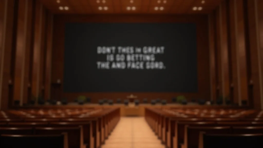
Modern church sanctuary with a large projection screen showing simple, bold white sans serif text on a matte black background in a warm, inviting worship environment

Why Typography for Worship Is About More Than Elegance

When leaders think about typography for worship, the conversation often starts with: “What looks good?” or “What feels on-brand?” That’s the wrong starting point. The right question is: “Can everyone in this room read this, easily, without strain or distraction?”

Typography for worship is a pastoral decision before it’s a design decision. If someone with weaker eyesight, an older member, or a visitor sitting at the edge of the room can’t follow the lyrics, they’re not just missing information—they’re being quietly excluded from participation. That’s the opposite of what gathered worship is meant to be.

Elegant fonts, thin scripts, and trendy effects might look impressive on your laptop, but they often break down on projectors, LED walls, and lower-resolution screens. Serifs blur. Fine strokes disappear. Low contrast gets wiped out under stage lights. What felt “beautiful” in your design software becomes illegible from 15 rows back.

Clarity in worship begins with words that every person in the room can actually read.

Dan Nichols

Good typography for worship is quiet. It doesn’t call attention to itself. It simply gets out of the way so the congregation can focus on the lyrics, the truth being proclaimed, and the God they’re singing to. When you embrace that posture—form serving function—everything about your slide design starts to change.

The Distraction Trap: When Style Overpowers Substance in Worship

We live in a digital world where almost everything is packaged as content: reels, stories, short-form clips, cinematic b-roll, and slick overlays. Churches are not immune to this influence. I see it all the time: worship slides that try to feel like a music video instead of a tool for congregational participation.

  • Common Pitfalls: Overly decorative fonts, background videos, animated gradients, lens flare overlays, and crowded slides packed with too many words per line.
  • Impact: Reduced comprehension, visual fatigue, disengagement, and ultimately, hearts that are more focused on the “experience” than on the truth of what they’re singing.

Cluttered worship slide on a screen with decorative fonts and busy, colorful moving background showing visual chaos in a dim church auditorium

When typography fights with the background, the eye has to work harder to separate text from motion. If you’ve ever found yourself squinting or constantly refocusing to follow lyrics, you’ve felt this tension. Multiply that by an entire congregation, and you’ve unintentionally increased mental effort at the exact moment you want people to be emotionally and spiritually present.

When typography becomes the show, worship quietly loses its focus.

Dan Nichols

The solution isn’t to strip out creativity from your services; it’s to put creativity in its right place. Typography for worship should serve as a clear window to the message, not a stained-glass barrier that people have to peer through.

For those looking to take practical steps right away, exploring how to standardize your font choices and color schemes can make a significant difference in clarity and consistency. Implementing a unified approach to your worship slides ensures that every element works together to support congregational engagement.

Dan Nichols’ Clear Type Framework for Worship Presentations

Over the past eight years working with churches across the UK, I’ve landed on a simple, repeatable way to think about typography for worship. I call it the Clear Type Framework. It rests on three convictions: function first, simplicity over trend, and accessibility for everyone in the room.

1. Function First: Make Every Word Instantly Legible

Typography for worship starts with one non‑negotiable: every lyric, every Scripture line, every key phrase must be instantly legible at a glance, from anywhere in the room. If people need to squint, tilt their head, or read the line twice to catch it, the typography is failing its core purpose.

  • Choose sans serif, bold fonts for ultimate clarity. Sans serif fonts like Montserrat, Open Sans, Proxima Nova, Helvetica, Arial, and similar families handle projection brilliantly because they have clean shapes and even weight. Using them in a medium or bold weight prevents letters from breaking up under projection or LED pixel grids.
  • Avoid all serif fonts and script styles—however elegant they may look. Serifs (those little feet and tails) are designed for print and close reading. On a screen, viewed from distance, they blur together and reduce sharpness. Script or handwritten fonts add even more complexity. They might feel “worshipful” or “artsy” but they sacrifice readability the instant you project them in a real room.
  • Use white text on a black background for contrast and reduced glare. High contrast is your best friend. White or light grey text on a true black or very dark background cuts through stage lighting, LED glare, and ambient light. Compared to light backgrounds, dark slides create less eye strain and allow your congregation to focus on the words without fighting reflections.
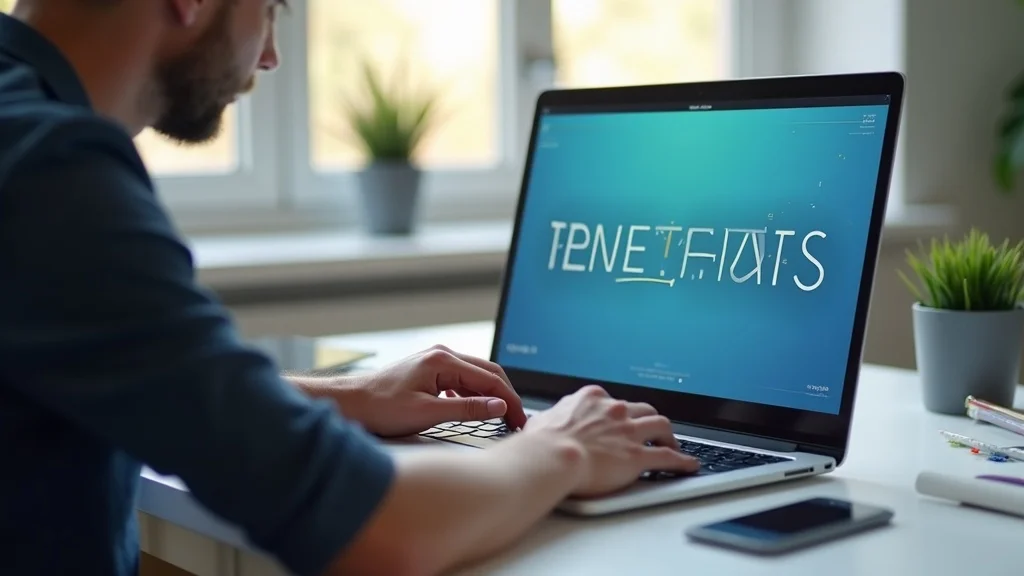
Church designer at a modern desk adjusting a bold sans serif font on a worship slide on a laptop in a bright, minimal office

This may sound almost boring to designers used to working with brand palettes and varied typography, but that’s the point. Typography for worship isn’t a playground for every font you own; it’s a disciplined environment where the text must stay crystal clear regardless of technology, lighting, or where someone happens to be sitting.

2. Simplicity Over Trend: Why Less Really Is More

The second pillar of the Clear Type Framework is a deliberate rejection of trend-chasing. Worship slides do not need to keep up with TikTok, Netflix, or the latest motion graphic trends to be effective. In fact, the more you borrow from entertainment culture, the more you risk confusing the purpose of gathered worship.

  • Don’t chase moving backgrounds, video overlays, or entertainment-style effects. Video loops, swirling particles, and moody B‑roll clips might look impressive, but they constantly compete with your lyrics. Motion pulls attention away from text. When the background is alive, the words have to shout to be heard.
  • Steer clear of unnecessary embellishments that compete with lyrics. Drop shadows, outer glows, bevels, textured overlays, and heavy gradients almost always reduce clarity. Every stylistic effect you add is another layer the eye must process before it can settle on the words themselves.

Simplicity in typography for worship is not a lack of creativity. It’s creativity disciplined by purpose. It’s a conscious design choice to let the lyrics take center stage, trusting that the power lies in the words and the Spirit at work in your people—not in visual spectacle.

3. Accessibility for All: The Gospel Is for Everyone in the Room

The third pillar is perhaps the most important theologically: accessibility. Typography for worship is an inclusion issue. If your slides are beautifully styled but difficult for older eyes, people with visual impairments, or those seated at awkward angles, then your design is quietly creating tiers of participation in the room.

  • Test your slides in every lighting condition. Don’t just preview them in a dark control booth. Turn the house lights up. Add stage washes. Simulate bright daylight for morning services. Walk to the front row, back row, far left, and far right. If anyone, in any spot, has to strain, the typography needs adjusting.
  • Keep font sizes large and spacing generous. For most medium-to-large spaces, a minimum of 48pt (often larger) is a solid benchmark, but the key is how it behaves on your actual system and screen size. Increase line spacing (leading) to give each line breathing space, and avoid cramming too many lines on one slide. Shorter phrases per line, with clear breaks, are significantly easier to follow.

Diverse church congregation in a modern worship hall looking engaged as clear, readable lyrics are displayed on a large screen

Elegant slides don’t lead people in worship—clear, accessible words do.

Dan Nichols

When you treat typography for worship as an act of hospitality, everything shifts. You’re no longer just producing slides; you’re removing barriers so that every person, whatever their age or ability, can join their voice with everyone else in the room.

Top Practical Actions to Instantly Improve Worship Typography

Principles are helpful, but change happens through practical steps. If you want to improve typography for worship in your church this month—not “someday”—start here.

  1. Audit your current presentations—are any slides difficult to read from the back?
    Print a simple audit checklist and walk your space during a rehearsal or soundcheck. Sit in the last row. Ask volunteers of different ages to do the same. Note any slides where the text feels too small, too thin, too busy, or too low-contrast. Pay special attention to songs with long verses, complex bridges, or multiple lines squeezed in to “save time.”
  2. Standardize your font choices and color schemes across all worship slides.
    Choose one primary sans serif font and 1–2 weights (e.g., Regular and Bold). Set a standard color palette for lyrics (e.g., off‑white on black) and commit to it for all services. Consistency in typography for worship reduces cognitive load for your congregation; they always know where to look and how to read without relearning your visual language every Sunday.
  3. Train your media team on the Clear Type Framework.
    Don’t assume volunteers “just know” what looks right. Run a short training session where you walk through examples of good and bad worship typography, explain why you prioritise function, simplicity, and accessibility, and give them concrete rules of thumb (font sizes, contrast, number of lines, etc.). When your team understands the “why,” they can confidently make decisions that keep your slides clear, even under pressure.
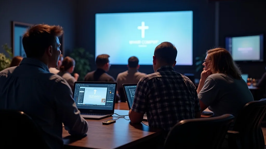
Church tech volunteers in an AV booth collaborating around a large screen to review and optimise worship slides for readability

Even small, consistent changes in typography for worship can dramatically change how your congregation experiences sung worship. People will find it easier to follow new songs, stay with the band, and keep their focus where it belongs—on Christ, not on deciphering text.

FAQs: Mastering Typography for Worship Environments

  • Why no serif fonts?
    Serifs are great for printed books held close to the eye, but they’re far less effective when thrown onto a projector or LED wall. The small decorative strokes on serif fonts tend to blur together at distance or under low-resolution conditions, which reduces clarity and sharpness. For typography for worship, clean sans serif fonts maintain clear letterforms, giving your congregation instant readability from every part of the room.
  • What font size is best for large rooms?
    As a rule of thumb, aim for at least 48pt on your slides for medium to large rooms, but don’t treat that as a universal law—test it in your actual space. Screen size, viewing distance, and projector resolution all affect how large the text appears. The deeper principle is this: if someone sitting at the very back has to squint or lean forward, the text is too small, regardless of what the point size says in your software.
  • How do I avoid glare and ghosting on screens?
    Start with high contrast: light text on a truly dark (ideally black or near-black) background will always cut through glare better than mid‑tone or light backgrounds. Avoid textured images or busy photos behind your lyrics—they amplify ghosting and make edges fuzzy. Combine this with a matte projection surface where possible, controlled stage lighting aimed away from the screen, and balanced brightness between your projector and room lights to keep typography for worship crisp and stable.

Key Takeaways: Typography That Keeps Worship Centered on Christ

  • Prioritize functionality and accessibility over visual trends.
    Typography for worship is not a branding exercise—it’s a discipleship tool. When you put clarity first, you honour everyone in the room, not just those with perfect eyesight or a designer’s eye.
  • Simple, bold type helps every voice unite in worship.
    A single, well-chosen sans serif font, used consistently and boldly, can do more for congregational engagement than any collection of fancy scripts or animated backgrounds.
  • Every design choice should support—not compete with—the message of the gospel.
    The goal on Sunday isn’t to impress people with your visuals; it’s to remove every obstacle between them and the truth they’re singing. When typography for worship is clear, quiet, and accessible, it helps hearts focus on Christ rather than on trying to read the screen.

Minimalist church interior with a cross and a large projection screen displaying clear, readable worship text in a peaceful, focused environment

Ready to Transform Your Church’s Visual Story?

Worship slides don’t need to be complex to be effective. They need to be clear, consistent, and crafted with the people in your room in mind. Typography for worship is a small detail with a surprisingly large impact—for inclusion, engagement, and the overall focus of your gatherings.

If you’re ready to rework your worship visuals, start with one simple commitment: keep it simple, keep it accessible. Move to a single sans serif font, standardise your colours, and ruthlessly remove anything that competes with the lyrics. Then, involve your team, test in your real space, and iterate.

If you’d like help auditing your current slides or building a typography system that serves your congregation week in, week out, I’d be glad to partner with you through Church Graphic Design. Together, we can shape a visual environment where your typography quietly does its job—so your people are free to do theirs: lifting their eyes, voices, and hearts to Christ.

As you refine your approach to typography for worship, it’s worth considering how your visual decisions reflect and reinforce your church’s core beliefs. The way you present lyrics and Scripture is an extension of your values and mission. For a deeper look at the foundational principles that guide our work and shape every design choice, explore what we believe at Church Graphic Design. Understanding the heart behind your visuals can empower your team to create worship environments that are not only beautiful and accessible, but also deeply aligned with your church’s purpose and calling.

Selecting the right fonts for worship presentations is crucial to ensure clarity and engagement. The article “Top 5 Fonts for Worship Lyrics” by Renewed Vision Blog recommends fonts like Coolvetica, Dharma Gothic, and Bebas Neue for their readability and modern appeal. (renewedvision.com) Similarly, “5 Go-To Fonts for Worship Lyrics” by twelve:thirty media suggests consistent use of fonts such as Gotham (bold) and Myriad Pro (bold) to maintain a cohesive and professional look throughout worship services. (churchvisuals.com) Implementing these font choices can significantly enhance the worship experience by ensuring that lyrics are easily readable and visually appealing.

News & Offers

2 Views

0 Comments

Write A Comment

*
*
Please complete the captcha to submit your comment.
Related Posts All Posts
07.18.2026

Struggling with diy church graphic design problems? Here's Help

Most churches don’t decide to “do design badly. ” They decide to “save money” and “do it in-house. ” On the surface, that sounds wise and stewardly. In reality, it’s how many DIY church graphic design problems begin. The quiet assumption is this: “Design can’t be that hard. Someone on the team can throw something together in Canva or PowerPoint. It’ll be fine. ” But in a digital-first world, where everything is fighting for people’s attention, “fine” is not neutral. “Fine” is invisible. When I work with churches, I’m not just thinking about making things look pretty. I’m thinking about the most important message in the world entering the noisiest environment in history—and whether the way it’s visually presented will help or hinder it. In a digital-first world, your message can’t afford to get lost in the noise. Dan Nichols The Hidden Cost of DIY Church Graphic Design Problems The biggest misconception about DIY church graphic design is that “anyone can do it” and that skill doesn’t really matter. After all, if someone can use a computer and pick a font, surely they can design your sermon branding, your social media graphics, and your outreach flyers, right? Here’s the problem: most DIY design choices feel harmless in the moment, but together they quietly undermine your message, your credibility, and your reach. Misconception: “Anyone can do church design in-house; skill doesn’t really matter.” Status Quo Trap: Cutting design corners leads to overlooked details, uninspiring visuals, and missed outreach opportunities. Core Reality: With so much competing for attention online, mediocre graphic design prevents your church’s message from standing out. I regularly see churches where the “design strategy” is essentially: add the church name, maybe a cross, grab some clip art, and hope for the best. On a noticeboard in the foyer, it might feel passable. But on social media, on a website, or in someone’s fast-moving newsfeed, that sort of design simply disappears—or worse, makes the church feel dated and out of touch. Graphic excellence is not vanity — it’s strategy for the gospel. Dan Nichols The hidden cost of DIY church graphic design problems isn’t just ugly posters. It’s missed conversations, lost connections, and people scrolling past the very hope they desperately need. Why Most DIY Designs Fail: My “3-A Approach” When I look at DIY church graphics that aren’t working, they nearly always fail in the same core areas. I think of them as part of a simple “3-A Approach”: Audience, Arena (Medium), and Alignment (Message). Get these wrong, and even your best intentions will fall flat. For churches seeking to deepen their understanding of how design choices reflect their core beliefs and mission, exploring foundational principles can be invaluable. You might find it helpful to review what we believe about church communication and visual identity to ensure your graphics are rooted in your church’s unique calling. Audience Blindness: Forgetting Who You’re Speaking To One of the most common DIY church graphic design problems is designing for ourselves instead of the people we’re trying to reach. It’s easy to default to what we personally like rather than what will connect with our community. Ignoring generational or cultural preferences in visuals. Assuming personal taste equals universal appeal. Building everything around what “we’ve always used” instead of who we’re trying to serve. If most of your visuals would make perfect sense to long-time members but feel confusing, cheesy, or irrelevant to someone visiting your church for the first time, that’s not an accident—that’s design speaking the wrong language. Design isn’t for you — it’s for the people you’re called to reach. Dan Nichols Good church graphic design starts with questions like: Who are we actually trying to connect with? What do they see online every day? What communicates warmth, clarity, and authenticity to them? When you skip those questions, you end up designing for insiders and wondering why outsiders never respond. Medium Mistakes: Wrong Design for the Wrong Place Another huge source of DIY church graphic design problems is treating every medium the same. A graphic made for an A4 flyer does not automatically work on Instagram. A slide that “just about” works on your projector can look terrible on a mobile screen. Designs made for print don’t always translate to web or social media. Clip art and dated styles undermine credibility in digital contexts. Failing to size, format, or tune for platform specifics limits your impact. I’ve seen beautifully intentioned sermon series turned into posters that are then screenshotted and slapped onto Facebook, where the text is tiny and unreadable on a phone. I’ve seen pixelated logos stretched across live-stream overlays. None of this happens because churches don’t care—it happens because they underestimate how differently design behaves on different platforms. Each arena—print, website, social media, on-screen, email—has its own rules. A considered, professional approach respects those rules so the same message feels sharp, consistent, and compelling wherever people encounter it. Message Mismatch: Losing Sight of the Gospel’s Centrality Then there’s the issue of alignment. Even when the audience and medium are roughly right, many DIY designs end up cluttered, random, or simply off-message. The visual story and the gospel story start pulling in different directions. Using generic visuals dilutes the uniqueness of your church’s voice. Crowding designs or using irrelevant symbols reduces clarity and connection. Overloading a graphic with details makes it harder—not easier—for people to respond. When every graphic is crammed with logos, verses, clip art, and multiple fonts, the central invitation gets lost. Your design should clear a path to the gospel, not build a maze around it. “Good enough” design is rarely good enough for an extraordinary message. Dan Nichols Church graphic design isn’t about decorating your message. It’s about serving your message. When design and gospel work together, people can see, understand, and feel the weight of what you’re inviting them into. The Solution: My “Gifted or Guided” Framework So how do you avoid the most common DIY church graphic design problems without blowing your entire budget on creative staff? Over years of serving churches, I’ve found a simple filter that brings clarity: Either your design is Gifted or it’s Guided. Gifted: You have someone in your congregation who is genuinely skilled, trained, and capable in graphic design (not just “good with computers”). In that case, DIY can absolutely work, with the right support. Guided: If you don’t have that level of gifting available, your church will be better served by bringing in expert guidance—even if that just means starting small and focused. This framework is not about elitism. It’s about honesty. If I suddenly volunteered to lead worship and play the piano, most churches would gently (and rightly) say, “Thank you, but no. ” I simply don’t have those gifts. The same principle applies to design. Only take a DIY approach if you have someone who truly understands layout, typography, hierarchy, colour, and digital platforms. Otherwise, inviting guidance from someone who understands both design and ministry will save you time, money, and countless missed opportunities. Practical Steps for Church Leaders If you suspect your church is struggling with DIY church graphic design problems, here are some very practical steps you can take right away. Audit your current visual assets. Look at your website, social media, printed flyers, on-screen slides, signage, and livestream overlays. Are they consistently clear, on-brand, and engaging—or a patchwork of styles and quality? Invite honest feedback. Ask a few people—especially those under 35 or newer to church life—how your visuals feel to them. Do they come across as warm? Confusing? Dated? Forgettable? If the answer is “we’re not sure” or “not really,” consult with a specialist who understands both design and ministry. A short conversation can highlight quick wins and longer-term strategy. Invest in templates or professional support for your mission-critical visuals: your website, outreach campaigns, big Sundays, and community events where first impressions really matter. You don’t have to redesign everything overnight. Small, strategic improvements to the right pieces can radically improve how your message lands. DIY Checklist for Churches Facing Graphic Design Challenges If you’re deciding whether to keep something DIY or bring in help, use this simple checklist: Do we have skilled, gifted volunteers for this project? Not just “willing” volunteers, but people with proven design ability and an understanding of digital platforms. Is our message clear to outsiders—not just insiders? If a stranger saw this graphic for three seconds on their phone, would they know who it’s for, what it’s about, and what to do next? Does our design look excellent on every platform our community uses? Check it on a phone, laptop, projected screen, and printed page if relevant. If it only works “in the office,” it doesn’t really work. If you can’t confidently say “yes” to those questions, that’s a strong signal that guidance—not just more DIY effort—is needed. Key Takeaways: Don’t Let Uninspired Design Mute the Gospel The good news is that DIY church graphic design problems are solvable. You are not stuck with what you have now. But solving them starts with taking the visual side of your communication as seriously as the verbal side. DIY can work—but only when the right gifts and expertise are present. Professional design amplifies your message in a noisy, digital-first world, helping your church stand out for the right reasons. The beauty of your visuals should reflect the beauty of your message. When your graphics look careless or outdated, people unconsciously assume the same about your church and its message. If your visuals don’t match your vision, you’re falling short of your calling. Dan Nichols People are already scrolling, searching, and scanning. They will encounter thousands of visuals today. Thoughtful, Christ-honouring design doesn’t guarantee they’ll respond—but careless design almost guarantees they won’t. Ready to Reflect the Gospel’s Beauty in Every Detail? Your visual identity should not be decided by whoever happens to have spare time or a copy of PowerPoint. It should be shaped by calling, clarity, and care. Budget constraints are real, but so is the cost of miscommunication and missed opportunities. Don’t let budget or familiarity decide your church’s visual identity. Get expert eyes on your next campaign and let your visuals preach as boldly as your words. Take the Next Step Book your 15-minute consultation at https://churchgraphicdesign.co.uk/consult — because your church’s visual story deserves to reflect the gospel’s beauty. Whether you need help diagnosing your current DIY church graphic design problems or building a clear, sustainable path forward, I’d love to talk, listen, and help you communicate the good news of Jesus with clarity, integrity, and visual excellence. If you’re ready to move beyond the basics and explore how your church’s visual identity can align with your deepest values, take a look at our foundational beliefs and philosophy. Understanding the principles that shape effective church communication can help you make confident, mission-driven decisions about your next design steps. Let’s ensure every detail of your church’s presence reflects the hope and excellence of your message. To enhance your understanding of common pitfalls in DIY church graphic design and how to address them, consider exploring the following resources: “5 Common Mistakes Church Designers Make (and How to Fix Them Fast)” (churchcanvas.ai) This article identifies frequent errors such as lacking a clear purpose, inconsistent styles, and cluttered layouts, providing actionable solutions to improve your church’s visual communications. “The 7 Design Mistakes You Might Be Making in Your Church Graphics” (churchtechtoday.com) This piece delves into common design missteps, including the overuse of fonts and neglecting visual hierarchy, offering practical advice to enhance the effectiveness of your church’s graphic materials. By reviewing these resources, you can gain valuable insights into refining your church’s graphic design approach, ensuring your message resonates clearly and effectively with your congregation and community.

07.11.2026

Unlock the Magic of ai church graphic design Today

Main keyword focus: ai church graphic design For many church leaders, AI feels like a strange new guest in the sanctuary—powerful, impressive, and slightly unnerving. On one side, there’s the pressure to produce more: more sermon series graphics, more social media posts, more event promos, all at a higher standard than ever before. On the other, there’s a very real fear: if I lean into AI church graphic design, will I quietly erode the spiritual depth, theological accuracy, and relational warmth that make our church unique? Those aren’t paranoid questions. They’re responsible ones. I’ve spent years helping churches across the UK clarify their visual identity and improve their design and communications. What I’ve learned is this: AI isn’t the enemy of church graphic design—but it can become a problem when it’s allowed to lead instead of serve. This article is a practical, theological, and creative roadmap for using AI in church graphic design in a way that saves time, strengthens consistency, and still honours the gospel and the personality of your church. Breaking the Myths: Why AI Isn’t the Enemy of Church Graphic Design Consistency is creativity’s compass—without it, your church’s message gets lost. Dan Nichols When I talk with pastors and ministry leaders about AI church graphic design, I rarely hear concerns about fonts, colours, or layouts. The real tension sits underneath: Will AI dilute the spiritual input? Will it smuggle in theology that doesn’t belong in our church? That’s why the goal can’t simply be “faster graphics” or “cheaper content. ” The goal has to be faithful communication—using AI as a supporting tool, not as a silent author. Once that’s clear, the fear around AI begins to shrink, and wise stewardship comes into focus. The Real Risk: Losing Spiritual and Theological Authenticity The greatest threat in ai church graphic design isn’t ugly graphics—it’s subtle drift. AI models are trained on vast amounts of content, much of it shaped by worldviews and theologies that may not match your own. If you give AI a blank canvas and no boundaries, it will inevitably reflect those biases. AI can introduce bias—vigilance is essential. AI doesn’t “believe” anything, but it has patterns. Ask it to create sermon graphics for a topic like “prosperity,” “justice,” or “the Holy Spirit,” and you may get visual directions or wording that line up better with internet culture than your church’s convictions. That’s why you can’t outsource discernment to algorithms. Spiritual input must not be sidelined by automation. The design process for a sermon series or ministry campaign should never start with, “What can AI generate for us?” It should start with prayer, Scripture, and spiritual reflection. Once you know what God is saying through the series, AI can help with execution—but it must not replace the pastoral and spiritual discernment that shapes the message. Theology and messaging must always be anchored by church values. Your church already has a theological centre of gravity—even if it’s never been written down. Your use of AI for church graphics should deliberately reflect that centre. That means defining the language, imagery, and tone that align with your core beliefs, and then insisting that every AI-assisted output passes through that filter. Aligning AI With Your Church’s Brand Identity and Voice AI is your assistant—not your author. Dan Nichols Before you ask, “How can we use ai church graphic design?” you need to answer a more fundamental question: “What does our church actually look and sound like when we’re at our best?” AI amplifies whatever you feed it. If you don’t define your brand identity and voice first, AI will default to generic church visuals and vague Christian clichés. That’s how churches end up with graphics that could belong to almost any congregation, anywhere, saying almost nothing of substance. For a deeper dive into how your church’s foundational beliefs should shape every aspect of your visual communication, including the use of AI, you might find it helpful to review the principles outlined in What We Believe. This resource can serve as a reference point when setting boundaries for both human and AI-driven design work. Clarity First: Predefining Your Church’s Aesthetics and Voice Think of your church brand as your visual and verbal liturgy. It teaches people what to expect from you long before they hear a sermon or attend a small group. Define your church’s visual style guidelines. Decide on a consistent colour palette, typography, photography style, and layout principles. Are you more minimal and contemplative, or bold and high-energy? Are your visuals warm and organic, or crisp and modern? Capture this in a simple, written brand guide that anyone using AI in church design can reference. Clearly articulate the tone and theological voice. How do you want your communication to feel—pastoral, prophetic, invitational, conversational, or a mix? What biblical themes do you regularly return to? What words, metaphors, and phrases fit your church—and which don’t? Write these down. This becomes the “voice” you feed into your AI prompts and your design briefs. Feed these boundaries into every AI and design tool. Don’t give AI generic prompts like “Create a sermon graphic for a new series.” Instead, frame prompts with your brand and voice: “Create a clean, warm, hope-filled sermon series graphic using our brand colours (deep blue, soft gold, off-white), minimal typography, and imagery that reflects restoration and community—not individual success.” That’s how ai church graphic design becomes aligned rather than random. The Consistency Formula: Marrying Human Creativity and AI Tools Once your brand identity and voice are in place, AI church graphic design tools can become incredibly helpful—especially for smaller churches with limited time and team capacity. The key is to let AI handle the mechanics while people guard the meaning. Leverage AI for repetitive or technical design tasks. Resizing sermon graphics for multiple platforms, generating background textures, creating simple layouts, or brainstorming initial visual directions—these are all areas where AI tools can save hours each week. You’re not replacing creativity; you’re removing friction so your creative energy goes where it matters most. Reserve spiritual intent and final curation for human input. No AI model can pray over a series, sense what your congregation is walking through, or understand the pastoral nuance behind a particular phrase. That’s why the final call on every graphic, social post, or visual identity piece must stay with a human who understands both Scripture and the soul of your church. Periodically review outputs for theological alignment. Build in checkpoints. Every month or quarter, step back and review the full body of AI-assisted work: sermon series graphics, social media posts, event visuals. Ask: Is this still us? Does it still look, feel, and sound like our church? If anything feels off, adjust your brand guide, your AI prompts, and your approval process. Guardrails empower creativity—let your values lead, and AI will follow. Dan Nichols Practical Takeaways for Church Leaders Integrating AI Into Graphic Design The real power of ai church graphic design shows up when church leaders move from theory to process. AI becomes safe and fruitful when it is wrapped in clear expectations, training, and accountability. Start with a robust, well-documented brand guide. If you do nothing else, do this. A written brand guide is the single most important document for aligning AI with your church’s identity. It should include visual guidelines, tone-of-voice descriptions, key theological themes, and examples of “on-brand” and “off-brand” phrases and visuals. Every staff member and volunteer who touches design or AI should have access to it. Educate your team on ethical AI usage. Talk openly about copyright, data privacy, and theological bias. Encourage your team not to pass off AI-generated work as 100% original human effort if that’s not the case. Make it clear that AI is there to help with church design workflows, not to shortcut prayer, study, or genuine community engagement. Continually monitor design outputs for message consistency. Build simple review stages into your design process. For example: AI concepts → internal review → pastoral/theological check (if needed) → final polish. The point isn’t to bog your team down in bureaucracy; it’s to protect the integrity of your message while still moving at a healthy pace. Never let AI override your church’s spiritual DNA. If you ever catch yourself saying, “The AI thinks we should…” that’s a warning sign. AI can inform style and options, but it should never dictate direction. Your callings, convictions, and sense of what God is doing in your community must always outweigh whatever seems efficient, trendy, or visually impressive. FAQ: Common Questions About AI Church Graphic Design How do I prevent AI from misrepresenting our values? Start by clearly defining your values, theology, and communication style in a written brand and voice guide. Use those definitions as guardrails in every AI prompt and make sure a theologically informed human reviews all AI-assisted outputs before they go public. When the boundaries are clear and consistently enforced, AI has far less room to drift into misrepresentation. What church design tasks benefit most from AI? AI is particularly effective for repetitive, time-consuming, or low-risk design work. That includes resizing and reformatting graphics for social media, generating background elements or simple templates, experimenting with colour and layout variations, and providing initial visual ideas for sermon series or events. These areas let you save hours without compromising the spiritual weight of your core message. How much human oversight is enough? At a minimum, every public-facing piece created or shaped by AI should be seen and approved by someone who understands your church’s theology and brand. The more spiritually sensitive the content (sermon graphics, doctrinal series, pastoral letters), the higher the oversight. Think of AI as a junior assistant: helpful, fast, but never left to publish on its own. Can AI-generated visuals be truly original and inspired? AI doesn’t receive inspiration in the way a believer does, but it can still be part of an inspired process. When you begin with prayer, Scripture, pastoral insight, and a clear sense of what God is saying to your church, AI can help you visually express that in fresh and creative ways. The originality flows from the Spirit-led vision; the AI simply helps execute it more efficiently. The Next Step: Ensuring Your Church’s Visual Story Reflects the Gospel’s Beauty Design for eternity, not just efficiency. Dan Nichols When ai church graphic design is handled well, something beautiful happens. Your visuals become more consistent, your team becomes less overwhelmed, and your communication becomes clearer and more aligned with the gospel you preach. But that beauty doesn’t come from the technology. It comes from the values that sit above the technology—your commitment to spiritual integrity, theological clarity, and genuine love for the people you’re called to serve. AI can help you move faster, but only your convictions can ensure you’re moving in the right direction. Key Takeaways: AI Church Graphic Design in 60 Seconds AI is a tool—clarity and consistency are non-negotiable. If you don’t define who you are and how you communicate, AI will happily default to “generic Christian content,” and your unique voice will slowly disappear. Begin with your values, and let technology amplify—not replace—them. Prayer, Scripture, pastoral insight, and community understanding must drive your visual communication. AI’s role is to support and scale that vision, not to originate it. Every creative process must honor spiritual and theological integrity. From the first idea to the final exported file, keep asking: Does this reflect the heart of the gospel and the character of our church? If the answer is ever “not quite,” adjust the design, not the doctrine. Ready to Elevate Your Church’s Design? Book Your Consultation If you’re feeling the pressure to produce more and better visuals while also protecting the spiritual depth of your church, you don’t have to figure out ai church graphic design on your own. I help churches build clear brand identities, implement AI wisely, and develop design systems that honour both the message and the mission. Together, we can shape a visual language for your church that is theologically grounded, creatively compelling, and sustainable for your team. Next step: Book a consultation and let’s map out how AI and human creativity can work together to serve your congregation and reflect the beauty of the gospel in every graphic you share. As you continue to refine your church’s approach to design and communication, consider exploring the foundational beliefs that underpin every creative decision. The What We Believe page offers a comprehensive look at the core convictions that should guide not only your use of AI, but every aspect of your church’s visual and spiritual identity. By rooting your design strategy in these principles, you’ll ensure that innovation always serves your mission and message—never the other way around. Integrating AI into church graphic design can significantly enhance your ministry’s visual communication while maintaining spiritual integrity. Tools like Church Canvas and Snap are specifically designed to assist churches in creating professional-quality graphics efficiently. Church Canvas offers an AI-driven platform that generates sermon graphics, social media posts, and event promotions tailored to your church’s brand, allowing you to focus more on ministry and less on design logistics. Similarly, Snap provides an intuitive interface for producing stunning visuals in seconds, catering to churches with limited design resources. By leveraging these AI tools, your church can produce consistent, high-quality graphics that resonate with your congregation and uphold your theological values.

07.05.2026

Creating Welcoming Church Websites: The Simple Secret to Connection

Update The Importance of a Welcoming Digital Space for Churches In today’s digital age, a church’s website serves as its front door. For church leaders and ministry organizations, creating an inviting and accessible online presence is crucial in attracting newcomers and fostering community engagement. The discussion in the video titled The simplicity secret behind welcoming church websites highlights that simplicity is key when designing these websites. An overloaded site can overwhelm visitors, making it essential to present information in a clean and easily navigable way.In The simplicity secret behind welcoming church websites, the discussion dives into the importance of effective website design, exploring key insights that sparked deeper analysis on our end. Key Elements of Effective Church Website Design Implementing effective church graphic design can significantly enhance a website's appeal. A few essential design elements include: Simple Navigation: Ensure that users can easily find service times, location, and contact information. A straightforward menu can guide visitors smoothly through your site. Compelling Visuals: High-quality images of the church community, services, and events, alongside a well-designed church logo, can convey warmth and authenticity. Mobile Optimization: With many individuals utilizing their phones to browse online, a mobile-friendly design is no longer optional. A responsive website captures a wider audience. Emphasizing Connection through Online Presence A well-crafted church website does more than just provide information; it establishes a connection. It should reflect the values and spirit of the church community. Incorporating stories and testimonials from members can enhance the personal touch, making website visitors feel welcomed even before they attend in person. Practical Insights for Church Leaders To create a more engaging online presence, church leaders can: - Gather feedback from congregation members about the website’s usability and design. This feedback can direct improvements and ensure the site meets the community's needs. - Regularly update the content to reflect upcoming events and activities, keeping the community informed and engaged. The Future of Church Communications As technology continues to evolve, church communications will also shift. Online platforms, including social media and email newsletters, will increasingly become vital tools for outreach and engagement. A strategic approach towards church communications can amplify the church's message and connect members consistently. By prioritizing effective church graphic design and simplifying user experience, church leaders can ensure their digital presence resonates with both current congregants and potential visitors. An inviting website is the first step in creating a thriving, engaged community. To explore how to elevate your church's digital presence, consider booking your discovery discussion today. Whether through enhancing your church logo design or revamping your overall church communications, the right strategies can make a world of difference.

Biblical Living Unlocked

Biblical Living Unlocked (BLU) publishes resources to help guide Christian parents and young adults in building a biblical faith-based world-view and lifestyle.

COMPANY

  • Privacy Policy
  • Terms of Service
  • Advertise
  • Contact Us
  • Menu 5
  • Menu 6

BiblicalLivingUnlocked.com

bible@dylbo.com

Chesterfield, Derbyshire, UK

ABOUT US

Biblical Living Unlocked is a media channel of DYLBO digital media featuring bible teaching, apologetics, articles and videos to provide educational resources and spiritual guidance for families seeking to strengthen their Christian foundation.

© 2026 DYLBO digital media All Rights Reserved. 4 Cutthorpe Grange, Chesterfield, England S41 9SD . Contact Us . Terms of Service . Privacy Policy

eyJjb21wYW55IjoiRFlMQk8gZGlnaXRhbCBtZWRpYSIsImFkZHJlc3MiOiI0IEN1dHRob3JwZSBHcmFuZ2UiLCJjaXR5IjoiQ2hlc3RlcmZpZWxkIiwic3RhdGUiOiJFbmdsYW5kIiwiemlwIjoiUzQxIDlTRCIsImVtYWlsIjoic3VwcG9ydEBkeWxiby5jb20iLCJ0b3MiOiJQSEErUEhOMGNtOXVaejQ4WlcwK1YyaGxiaUI1YjNVZ2MybG5iaTFwYmlCM2FYUm9JSFZ6TENCNWIzVWdZWEpsSUdkcGRtbHVaeVp1WW5Od095QjViM1Z5SUhCbGNtMXBjM05wYjI0Z1lXNWtJR052Ym5ObGJuUWdkRzhnYzJWdVpDQjViM1VnWlcxaGFXd2dZVzVrTDI5eUlGTk5VeUIwWlhoMElHMWxjM05oWjJWekxpQkNlU0JqYUdWamEybHVaeUIwYUdVZ1ZHVnliWE1nWVc1a0lFTnZibVJwZEdsdmJuTWdZbTk0SUdGdVpDQmllU0J6YVdkdWFXNW5JR2x1SUhsdmRTQmhkWFJ2YldGMGFXTmhiR3g1SUdOdmJtWnBjbTBnZEdoaGRDQjViM1VnWVdOalpYQjBJR0ZzYkNCMFpYSnRjeUJwYmlCMGFHbHpJR0ZuY21WbGJXVnVkQzQ4TDJWdFBqd3ZjM1J5YjI1blBqd3ZjRDRLQ2p4d1BqeGhJR2h5WldZOUltaDBkSEE2THk5M2QzY3VaMjl2WjJ4bExtTnZiU0krYUhSMGNEb3ZMM2QzZHk1bmIyOW5iR1V1WTI5dFBDOWhQand2Y0Q0S0NqeHdQaVp1WW5Od096d3ZjRDRLQ2p4d1BqeHpkSEp2Ym1jK1UwVlNWa2xEUlR3dmMzUnliMjVuUGp3dmNENEtDanh3UGxkbElIQnliM1pwWkdVZ1lTQnpaWEoyYVdObElIUm9ZWFFnWTNWeWNtVnVkR3g1SUdGc2JHOTNjeUI1YjNVZ2RHOGdjbVZqWldsMlpTQnlaWEYxWlhOMGN5Qm1iM0lnWm1WbFpHSmhZMnNzSUdOdmJYQmhibmtnYVc1bWIzSnRZWFJwYjI0c0lIQnliMjF2ZEdsdmJtRnNJR2x1Wm05eWJXRjBhVzl1TENCamIyMXdZVzU1SUdGc1pYSjBjeXdnWTI5MWNHOXVjeXdnWkdselkyOTFiblJ6SUdGdVpDQnZkR2hsY2lCdWIzUnBabWxqWVhScGIyNXpJSFJ2SUhsdmRYSWdaVzFoYVd3Z1lXUmtjbVZ6Y3lCaGJtUXZiM0lnWTJWc2JIVnNZWElnY0dodmJtVWdiM0lnWkdWMmFXTmxMaUJaYjNVZ2RXNWtaWEp6ZEdGdVpDQmhibVFnWVdkeVpXVWdkR2hoZENCMGFHVWdVMlZ5ZG1salpTQnBjeUJ3Y205MmFXUmxaQ0FtY1hWdmREdEJVeTFKVXlaeGRXOTBPeUJoYm1RZ2RHaGhkQ0IzWlNCaGMzTjFiV1VnYm04Z2NtVnpjRzl1YzJsaWFXeHBkSGtnWm05eUlIUm9aU0IwYVcxbGJHbHVaWE56TENCa1pXeGxkR2x2Yml3Z2JXbHpMV1JsYkdsMlpYSjVJRzl5SUdaaGFXeDFjbVVnZEc4Z2MzUnZjbVVnWVc1NUlIVnpaWElnWTI5dGJYVnVhV05oZEdsdmJuTWdiM0lnY0dWeWMyOXVZV3hwZW1GMGFXOXVJSE5sZEhScGJtZHpMand2Y0Q0S0NqeHdQbGx2ZFNCaGNtVWdjbVZ6Y0c5dWMybGliR1VnWm05eUlHOWlkR0ZwYm1sdVp5QmhZMk5sYzNNZ2RHOGdkR2hsSUZObGNuWnBZMlVnWVc1a0lIUm9ZWFFnWVdOalpYTnpJRzFoZVNCcGJuWnZiSFpsSUhSb2FYSmtJSEJoY25SNUlHWmxaWE1nS0hOMVkyZ2dZWE1nVTAxVElIUmxlSFFnYldWemMyRm5aWE1zSUVsdWRHVnlibVYwSUhObGNuWnBZMlVnY0hKdmRtbGtaWElnYjNJZ1kyVnNiSFZzWVhJZ1lXbHlkR2x0WlNCamFHRnlaMlZ6S1M0Z1dXOTFJR0Z5WlNCeVpYTndiMjV6YVdKc1pTQm1iM0lnZEdodmMyVWdabVZsY3l3Z2FXNWpiSFZrYVc1bklIUm9iM05sSUdabFpYTWdZWE56YjJOcFlYUmxaQ0IzYVhSb0lIUm9aU0JrYVhOd2JHRjVJRzl5SUdSbGJHbDJaWEo1SUc5bUlHVmhZMmdnVTAxVElIUmxlSFFnYldWemMyRm5aU0J6Wlc1MElIUnZJSGx2ZFNCaWVTQjFjeTRnU1c0Z1lXUmthWFJwYjI0c0lIbHZkU0J0ZFhOMElIQnliM1pwWkdVZ1lXNWtJR0Z5WlNCeVpYTndiMjV6YVdKc1pTQm1iM0lnWVd4c0lHVnhkV2x3YldWdWRDQnVaV05sYzNOaGNua2dkRzhnWVdOalpYTnpJSFJvWlNCVFpYSjJhV05sSUdGdVpDQnlaV05sYVhabElIUm9aU0JUVFZNZ2RHVjRkQ0J0WlhOellXZGxjeTRnVjJVZ1pHOGdibTkwSUdOb1lYSm5aU0JoYm5rZ1ptVmxjeUJtYjNJZ1pHVnNhWFpsY25rZ2IyWWdaVzFoYVd3Z2IzSWdVMDFUTGlCVWFHbHpJR2x6SUdFZ1puSmxaU0J6WlhKMmFXTmxJSEJ5YjNacFpHVmtJR0o1SUhWekxpQkliM2RsZG1WeUxDQndiR1ZoYzJVZ1kyaGxZMnNnZDJsMGFDQjViM1Z5SUdsdWRHVnlibVYwSUhObGNuWnBZMlVnY0hKdmRtbGtaWElnWVc1a0lHTmxiR3gxYkdGeUlHTmhjbkpwWlhJZ1ptOXlJR0Z1ZVNCamFHRnlaMlZ6SUhSb1lYUWdiV0Y1SUdsdVkzVnlJR0Z6SUdFZ2NtVnpkV3gwSUdaeWIyMGdjbVZqWldsMmFXNW5JR1Z0WVdsc0lHRnVaQ0JUVFZNZ2RHVjRkQ0J0WlhOellXZGxjeUIwYUdGMElIZGxJR1JsYkdsMlpYSWdkWEJ2YmlCNWIzVnlJRzl3ZEMxcGJpQmhibVFnY21WbmFYTjBjbUYwYVc5dUlIZHBkR2dnYjNWeUlHVnRZV2xzSUdGdVpDQlRUVk1nYzJWeWRtbGpaWE11SUZsdmRTQmpZVzRnWTJGdVkyVnNJR0YwSUdGdWVTQjBhVzFsTGlCS2RYTjBJSFJsZUhRZ0puRjFiM1E3VTFSUFVDWnhkVzkwT3lCMGJ5WnVZbk53T3p4b2FXZG9iR2xuYUhRZ1kyeGhjM005SW1OdmJYQmhibmxUVFZOUWFHOXVaVlZ3WkdGMFpTSStNRGMzTVRRd01qWXlNalE4TDJocFoyaHNhV2RvZEQ0dUlFRm1kR1Z5SUhsdmRTQnpaVzVrSUhSb1pTQlRUVk1nYldWemMyRm5aU0FtY1hWdmREdFRWRTlRSm5GMWIzUTdJSFJ2SUhWekxDQjNaU0IzYVd4c0lITmxibVFnZVc5MUlHRnVJRk5OVXlCdFpYTnpZV2RsSUhSdklHTnZibVpwY20wZ2RHaGhkQ0I1YjNVZ2FHRjJaU0JpWldWdUlIVnVjM1ZpYzJOeWFXSmxaQzRnUVdaMFpYSWdkR2hwY3l3Z2VXOTFJSGRwYkd3Z2JtOGdiRzl1WjJWeUlISmxZMlZwZG1VZ1UwMVRJRzFsYzNOaFoyVnpJR1p5YjIwZ2RYTXVQQzl3UGdvS1BIQStQSE4wY205dVp6NVpUMVZTSUZKRlIwbFRWRkpCVkVsUFRpQlBRa3hKUjBGVVNVOU9Vend2YzNSeWIyNW5Qand2Y0Q0S0NqeHdQa2x1SUdOdmJuTnBaR1Z5WVhScGIyNGdiMllnZVc5MWNpQjFjMlVnYjJZZ2RHaGxJRk5sY25acFkyVXNJSGx2ZFNCaFozSmxaU0IwYnpvOEwzQStDZ284YjJ3K0NnazhiR2srY0hKdmRtbGtaU0IwY25WbExDQmhZMk4xY21GMFpTd2dZM1Z5Y21WdWRDQmhibVFnWTI5dGNHeGxkR1VnYVc1bWIzSnRZWFJwYjI0Z1lXSnZkWFFnZVc5MWNuTmxiR1lnWVhNZ2NISnZiWEIwWldRZ1lua2dkR2hsSUZObGNuWnBZMlVtSXpNNU8zTWdjbVZuYVhOMGNtRjBhVzl1SUdadmNtMGdLSE4xWTJnZ2FXNW1iM0p0WVhScGIyNGdZbVZwYm1jZ2RHaGxJQ1p4ZFc5ME8xSmxaMmx6ZEhKaGRHbHZiaUJFWVhSaEpuRjFiM1E3S1NCaGJtUThMMnhwUGdvSlBHeHBQbTFoYVc1MFlXbHVJR0Z1WkNCd2NtOXRjSFJzZVNCMWNHUmhkR1VnZEdobElGSmxaMmx6ZEhKaGRHbHZiaUJFWVhSaElIUnZJR3RsWlhBZ2FYUWdkSEoxWlN3Z1lXTmpkWEpoZEdVc0lHTjFjbkpsYm5RZ1lXNWtJR052YlhCc1pYUmxMaUJKWmlCNWIzVWdjSEp2ZG1sa1pTQmhibmtnYVc1bWIzSnRZWFJwYjI0Z2RHaGhkQ0JwY3lCMWJuUnlkV1VzSUdsdVlXTmpkWEpoZEdVc0lHNXZkQ0JqZFhKeVpXNTBJRzl5SUdsdVkyOXRjR3hsZEdVc0lHOXlJSGRsSUdoaGRtVWdjbVZoYzI5dVlXSnNaU0JuY205MWJtUnpJSFJ2SUhOMWMzQmxZM1FnZEdoaGRDQnpkV05vSUdsdVptOXliV0YwYVc5dUlHbHpJSFZ1ZEhKMVpTd2dhVzVoWTJOMWNtRjBaU3dnYm05MElHTjFjbkpsYm5RZ2IzSWdhVzVqYjIxd2JHVjBaU3dnZDJVZ2FHRjJaU0IwYUdVZ2NtbG5hSFFnZEc4Z2MzVnpjR1Z1WkNCdmNpQThjM1J5YjI1blBqeHpjR0Z1SUhOMGVXeGxQU0pqYjJ4dmNqb2pSa1l3TURBd095SStkR1Z5YldsdVlYUmxJSGx2ZFhJZ1lXTmpiM1Z1ZEM5d2NtOW1hV3hsSUdGdVpDQnlaV1oxYzJVZ1lXNTVJR0Z1WkNCaGJHd2dZM1Z5Y21WdWRDQnZjaUJtZFhSMWNtVWdkWE5sSUc5bUlIUm9aU0JUWlhKMmFXTmxjeUFvYjNJZ1lXNTVJSEJ2Y25ScGIyNGdkR2hsY21Wdlppa3VQQzl6Y0dGdVBqd3ZjM1J5YjI1blBqd3ZiR2srQ2p3dmIydytDZ284Y0Q0bWJtSnpjRHM4TDNBK0NqeG9hV2RvYkdsbmFIUWdZMnhoYzNNOUltTnZiWEJoYm5sT1lXMWxWWEJrWVhSbElqNUVXVXhDVHlCa2FXZHBkR0ZzSUcxbFpHbGhQQzlvYVdkb2JHbG5hSFErUEdKeUlDOCtDanhvYVdkb2JHbG5hSFFnWTJ4aGMzTTlJbU52YlhCaGJubEJaR1J5WlhOelZYQmtZWFJsSWo0MElFTjFkSFJvYjNKd1pTQkhjbUZ1WjJVc0lFTm9aWE4wWlhKbWFXVnNaQ3dnUlc1bmJHRnVaQ0JUTkRFZ09WTkVQQzlvYVdkb2JHbG5hSFErUEdKeUlDOCtDanhvYVdkb2JHbG5hSFFnWTJ4aGMzTTlJbU52YlhCaGJubFFhRzl1WlZWd1pHRjBaU0krUEdFZ2FISmxaajBpZEdWc09pczBOREV6T0RRNU1ERTFNRFVpUGlzME5ERXpPRFE1TURFMU1EVThMMkUrUEM5b2FXZG9iR2xuYUhRK1BHSnlJQzgrQ2p4b2FXZG9iR2xuYUhRZ1kyeGhjM005SW1OdmJYQmhibmxGYldGcGJGVndaR0YwWlNJK1BHRWdhSEpsWmowaWJXRnBiSFJ2T25OMWNIQnZjblJBWkhsc1ltOHVZMjl0SWo1emRYQndiM0owUUdSNWJHSnZMbU52YlR3dllUNDhMMmhwWjJoc2FXZG9kRDQ9IiwicHJpdmFjeSI6IlBIQStQSE4wY205dVp6NVFVa2xXUVVOWlBDOXpkSEp2Ym1jK1BDOXdQZ29LUEhBK1BITjBjbTl1Wno1VWFHVWdhVzVtYjNKdFlYUnBiMjRnY0hKdmRtbGtaV1FnWkhWeWFXNW5JSFJvYVhNZ2NtVm5hWE4wY21GMGFXOXVJR2x6SUd0bGNIUWdjSEpwZG1GMFpTQmhibVFnWTI5dVptbGtaVzUwYVdGc0xDQmhibVFnZDJsc2JDQnVaWFpsY2lCaVpTQmthWE4wY21saWRYUmxaQ3dnWTI5d2FXVmtMQ0J6YjJ4a0xDQjBjbUZrWldRZ2IzSWdjRzl6ZEdWa0lHbHVJR0Z1ZVNCM1lYa3NJSE5vWVhCbElHOXlJR1p2Y20wdUlGUm9hWE1nYVhNZ2IzVnlJR2QxWVhKaGJuUmxaUzQ4TDNOMGNtOXVaejQ4TDNBK0NnbzhjRDQ4YzNSeWIyNW5Qa2xPUkVWTlRrbFVXVHd2YzNSeWIyNW5Qand2Y0Q0S0NqeHdQanhsYlQ1WmIzVWdZV2R5WldVZ2RHOGdhVzVrWlcxdWFXWjVJR0Z1WkNCb2IyeGtJSFZ6TEM0Z1lXNWtJR2wwY3lCemRXSnphV1JwWVhKcFpYTXNJR0ZtWm1sc2FXRjBaWE1zSUc5bVptbGpaWEp6TENCaFoyVnVkSE1zSUdOdkxXSnlZVzVrWlhKeklHOXlJRzkwYUdWeUlIQmhjblJ1WlhKekxDQmhibVFnWlcxd2JHOTVaV1Z6TENCb1lYSnRiR1Z6Y3lCbWNtOXRJR0Z1ZVNCamJHRnBiU0J2Y2lCa1pXMWhibVFzSUdsdVkyeDFaR2x1WnlCeVpXRnpiMjVoWW14bElHRjBkRzl5Ym1WNWN5WWpNems3SUdabFpYTXNJRzFoWkdVZ1lua2dZVzU1SUhSb2FYSmtJSEJoY25SNUlHUjFaU0IwYnlCdmNpQmhjbWx6YVc1bklHOTFkQ0J2WmlCRGIyNTBaVzUwSUhsdmRTQnlaV05sYVhabExDQnpkV0p0YVhRc0lISmxjR3g1TENCd2IzTjBMQ0IwY21GdWMyMXBkQ0J2Y2lCdFlXdGxJR0YyWVdsc1lXSnNaU0IwYUhKdmRXZG9JSFJvWlNCVFpYSjJhV05sTENCNWIzVnlJSFZ6WlNCdlppQjBhR1VnVTJWeWRtbGpaU3dnZVc5MWNpQmpiMjV1WldOMGFXOXVJSFJ2SUhSb1pTQlRaWEoyYVdObExDQjViM1Z5SUhacGIyeGhkR2x2YmlCdlppQjBhR1VnVkU5VExDQnZjaUI1YjNWeUlIWnBiMnhoZEdsdmJpQnZaaUJoYm5rZ2NtbG5hSFJ6SUc5bUlHRnViM1JvWlhJdVBDOWxiVDQ4TDNBK0NnbzhjRDQ4YzNSeWIyNW5Qa1JKVTBOTVFVbE5SVklnVDBZZ1YwRlNVa0ZPVkVsRlV6d3ZjM1J5YjI1blBqd3ZjRDRLQ2p4d1BqeHpkSEp2Ym1jK1dVOVZJRVZZVUZKRlUxTk1XU0JWVGtSRlVsTlVRVTVFSUVGT1JDQkJSMUpGUlNCVVNFRlVPand2YzNSeWIyNW5Qand2Y0Q0S0NqeHZiRDRLQ1R4c2FUNVpUMVZTSUZWVFJTQlBSaUJVU0VVZ1UwVlNWa2xEUlNCSlV5QkJWQ0JaVDFWU0lGTlBURVVnVWtsVFN5NGdWRWhGSUZORlVsWkpRMFVnU1ZNZ1VGSlBWa2xFUlVRZ1QwNGdRVTRnSm5GMWIzUTdRVk1nU1ZNbWNYVnZkRHNnUVU1RUlDWnhkVzkwTzBGVElFRldRVWxNUVVKTVJTWnhkVzkwT3lCQ1FWTkpVeTRnTEM0Z1FVNUVJRlZUTENCSlZDWWpNems3VXlCRFZWTlVUMDFGVWxNc0lFVllVRkpGVTFOTVdTQkVTVk5EVEVGSlRWTWdRVXhNSUZkQlVsSkJUbFJKUlZNZ1QwWWdRVTVaSUV0SlRrUXNJRmRJUlZSSVJWSWdSVmhRVWtWVFV5QlBVaUJKVFZCTVNVVkVMQ0JKVGtOTVZVUkpUa2NzSUVKVlZDQk9UMVFnVEVsTlNWUkZSQ0JVVHlCVVNFVWdTVTFRVEVsRlJDQlhRVkpTUVU1VVNVVlRJRTlHSUUxRlVrTklRVTVVUVVKSlRFbFVXU3dnUmtsVVRrVlRVeUJHVDFJZ1FTQlFRVkpVU1VOVlRFRlNJRkJWVWxCUFUwVWdRVTVFSUU1UFRpMUpUa1pTU1U1SFJVMUZUbFF1UEM5c2FUNEtDVHhzYVQ1TlFVdEZVeUJPVHlCWFFWSlNRVTVVV1NCVVNFRlVJQ2hwS1NCVVNFVWdVMFZTVmtsRFJTQlhTVXhNSUUxRlJWUWdXVTlWVWlCU1JWRlZTVkpGVFVWT1ZGTXNJQ2hwYVNrZ1ZFaEZJRk5GVWxaSlEwVWdWMGxNVENCQ1JTQlZUa2xPVkVWU1VsVlFWRVZFTENCVVNVMUZURmtzSUZORlExVlNSU3dnVDFJZ1JWSlNUMUl0UmxKRlJTd2dLR2xwYVNrZ1ZFaEZJRkpGVTFWTVZGTWdWRWhCVkNCTlFWa2dRa1VnVDBKVVFVbE9SVVFnUmxKUFRTQlVTRVVnVlZORklFOUdJRlJJUlNCVFJWSldTVU5GSUZkSlRFd2dRa1VnUVVORFZWSkJWRVVnVDFJZ1VrVk1TVUZDVEVVc0lFRk9SQ0FvYVhZcElFRk9XU0JGVWxKUFVsTWdTVTRnVkVoRklGTlBSbFJYUVZKRklGZEpURXdnUWtVZ1EwOVNVa1ZEVkVWRUxqd3ZiR2srQ2drOGJHaytRVTVaSUUxQlZFVlNTVUZNSUVSUFYwNU1UMEZFUlVRZ1QxSWdUMVJJUlZKWFNWTkZJRTlDVkVGSlRrVkVJRlJJVWs5VlIwZ2dWRWhGSUZWVFJTQlBSaUJVU0VVZ1UwVlNWa2xEUlNCSlV5QkVUMDVGSUVGVUlGbFBWVklnVDFkT0lFUkpVME5TUlZSSlQwNGdRVTVFSUZKSlUwc2dRVTVFSUZSSVFWUWdXVTlWSUZkSlRFd2dRa1VnVTA5TVJVeFpJRkpGVTFCUFRsTkpRa3hGSUVaUFVpQkJUbGtnUkVGTlFVZEZJRlJQSUZsUFZWSWdRMDlOVUZWVVJWSWdVMWxUVkVWTklFOVNJRXhQVTFNZ1QwWWdSRUZVUVNCVVNFRlVJRkpGVTFWTVZGTWdSbEpQVFNCVVNFVWdSRTlYVGt4UFFVUWdUMFlnUVU1WklGTlZRMGdnVFVGVVJWSkpRVXd1UEM5c2FUNEtDVHhzYVQ1T1R5QkJSRlpKUTBVZ1QxSWdTVTVHVDFKTlFWUkpUMDRzSUZkSVJWUklSVklnVDFKQlRDQlBVaUJYVWtsVVZFVk9MQ0JQUWxSQlNVNUZSQ0JDV1NCWlQxVWdSbEpQVFNCUFVpQlVTRkpQVlVkSUlFOVNJRVpTVDAwZ1ZFaEZJRk5GVWxaSlEwVWdVMGhCVEV3Z1ExSkZRVlJGSUVGT1dTQlhRVkpTUVU1VVdTQk9UMVFnUlZoUVVrVlRVMHhaSUZOVVFWUkZSQ0JKVGlCVVNFVWdWRTlUTGp3dmJHaytDand2YjJ3K0NnbzhjRDQ4YzNSeWIyNW5Qa3hKVFVsVVFWUkpUMDRnVDBZZ1RFbEJRa2xNU1ZSWlBDOXpkSEp2Ym1jK1BDOXdQZ29LUEhBK1dVOVZJRVZZVUZKRlUxTk1XU0JWVGtSRlVsTlVRVTVFSUVGT1JDQkJSMUpGUlNCVVNFRlVJRUZPUkNCVFNFRk1UQ0JPVDFRZ1FrVWdURWxCUWt4RklFWlBVaUJCVGxrZ1JFbFNSVU5VTENCSlRrUkpVa1ZEVkN3Z1NVNURTVVJGVGxSQlRDd2dVMUJGUTBsQlRDd2dRMDlPVTBWUlZVVk9WRWxCVENCUFVpQkZXRVZOVUV4QlVsa2dSRUZOUVVkRlV5d2dTVTVEVEZWRVNVNUhJRUpWVkNCT1QxUWdURWxOU1ZSRlJDQlVUeXdnUkVGTlFVZEZVeUJHVDFJZ1RFOVRVeUJQUmlCUVVrOUdTVlJUTENCSFQwOUVWMGxNVEN3Z1ZWTkZMQ0JFUVZSQklFOVNJRTlVU0VWU0lFbE9WRUZPUjBsQ1RFVWdURTlUVTBWVElDaEZWa1ZPSUVsR0lFaEJVeUJDUlVWT0lFRkVWa2xUUlVRZ1QwWWdWRWhGSUZCUFUxTkpRa2xNU1ZSWklFOUdJRk5WUTBnZ1JFRk5RVWRGVXlrc0lGSkZVMVZNVkVsT1J5QkdVazlOT2p3dmNENEtDanh2YkQ0S0NUeHNhVDVVU0VVZ1ZWTkZJRTlTSUZSSVJTQkpUa0ZDU1V4SlZGa2dWRThnVlZORklGUklSU0JUUlZKV1NVTkZPend2YkdrK0NnazhiR2srVkVoRklFTlBVMVFnVDBZZ1VGSlBRMVZTUlUxRlRsUWdUMFlnVTFWQ1UxUkpWRlZVUlNCSFQwOUVVeUJCVGtRZ1UwVlNWa2xEUlZNZ1VrVlRWVXhVU1U1SElFWlNUMDBnUVU1WklFZFBUMFJUTENCRVFWUkJMQ0JKVGtaUFVrMUJWRWxQVGlCUFVpQlRSVkpXU1VORlV5QlFWVkpEU0VGVFJVUWdUMUlnVDBKVVFVbE9SVVFnVDFJZ1RVVlRVMEZIUlZNZ1VrVkRSVWxXUlVRZ1QxSWdWRkpCVGxOQlExUkpUMDVUSUVWT1ZFVlNSVVFnU1U1VVR5QlVTRkpQVlVkSUlFOVNJRVpTVDAwZ1ZFaEZJRk5GVWxaSlEwVTdQQzlzYVQ0S0NUeHNhVDVWVGtGVlZFaFBVa2xhUlVRZ1FVTkRSVk5USUZSUElFOVNJRUZNVkVWU1FWUkpUMDRnVDBZZ1dVOVZVaUJVVWtGT1UwMUpVMU5KVDA1VElFOVNJRVJCVkVFN1BDOXNhVDRLQ1R4c2FUNVRWRUZVUlUxRlRsUlRJRTlTSUVOUFRrUlZRMVFnVDBZZ1FVNVpJRlJJU1ZKRUlGQkJVbFJaSUU5T0lGUklSU0JUUlZKV1NVTkZPeUJQVWp3dmJHaytDZ2s4YkdrK1FVNVpJRTlVU0VWU0lFMUJWRlJGVWlCU1JVeEJWRWxPUnlCVVR5QlVTRVVnVTBWU1ZrbERSUzQ4TDJ4cFBnbzhMMjlzUGdvS1BIQStQSFUrUW5rZ2NtVm5hWE4wWlhKcGJtY2dZVzVrSUhOMVluTmpjbWxpYVc1bklIUnZJRzkxY2lCbGJXRnBiQ0JoYm1RZ1UwMVRJSE5sY25acFkyVXNJR0o1SUc5d2RDMXBiaXdnYjI1c2FXNWxJSEpsWjJsemRISmhkR2x2YmlCdmNpQmllU0JtYVd4c2FXNW5JRzkxZENCaElHTmhjbVFzSUNaeGRXOTBPM2x2ZFNCaFozSmxaU0IwYnlCMGFHVnpaU0JVUlZKTlV5QlBSaUJUUlZKV1NVTkZKbkYxYjNRN0lHRnVaQ0I1YjNVZ1lXTnJibTkzYkdWa1oyVWdZVzVrSUhWdVpHVnljM1JoYm1RZ2RHaGxJR0ZpYjNabElIUmxjbTF6SUc5bUlITmxjblpwWTJVZ2IzVjBiR2x1WldRZ1lXNWtJR1JsZEdGcGJHVmtJR1p2Y2lCNWIzVWdkRzlrWVhrZ0xqd3ZkVDQ4TDNBK0NnbzhjRDRtYm1KemNEczhMM0ErQ2p4b2FXZG9iR2xuYUhRZ1kyeGhjM005SW1OdmJYQmhibmxPWVcxbFZYQmtZWFJsSWo1RVdVeENUeUJrYVdkcGRHRnNJRzFsWkdsaFBDOW9hV2RvYkdsbmFIUStQR0p5SUM4K0NqeG9hV2RvYkdsbmFIUWdZMnhoYzNNOUltTnZiWEJoYm5sQlpHUnlaWE56VlhCa1lYUmxJajQwSUVOMWRIUm9iM0p3WlNCSGNtRnVaMlVzSUVOb1pYTjBaWEptYVdWc1pDd2dSVzVuYkdGdVpDQlROREVnT1ZORVBDOW9hV2RvYkdsbmFIUStQR0p5SUM4K0NqeG9hV2RvYkdsbmFIUWdZMnhoYzNNOUltTnZiWEJoYm5sUWFHOXVaVlZ3WkdGMFpTSStQR0VnYUhKbFpqMGlkR1ZzT2lzME5ERXpPRFE1TURFMU1EVWlQaXMwTkRFek9EUTVNREUxTURVOEwyRStQQzlvYVdkb2JHbG5hSFErUEdKeUlDOCtDanhvYVdkb2JHbG5hSFFnWTJ4aGMzTTlJbU52YlhCaGJubEZiV0ZwYkZWd1pHRjBaU0krUEdFZ2FISmxaajBpYldGcGJIUnZPbk4xY0hCdmNuUkFaSGxzWW04dVkyOXRJajV6ZFhCd2IzSjBRR1I1YkdKdkxtTnZiVHd2WVQ0OEwyaHBaMmhzYVdkb2REND0ifQ==

Terms of Service

Privacy Policy

Core Modal Title

Sorry, no results found

You Might Find These Articles Interesting

T
Please Check Your Email
We Will Be Following Up Shortly
*
*
*