


If people in your town see your church logo on a flyer, your name on a Facebook post, and your sign on the main road—and still don’t realise it’s all the same church—you don’t have a communication problem. You have a branding problem.
A clear, consistent church branding guide is not about looking trendy or “corporate. ” It’s about helping people actually recognise your church, remember your message, and know what to do next. Without that cohesion, every flyer, social post, or noticeboard is just another isolated jigsaw piece that never forms a picture.
Over the last eight years working with churches across the UK, I’ve seen the difference a simple, well-used branding guide can make: more recognition in the community, clearer next steps for visitors, and a much stronger sense of trust. In this article, I’ll walk through why churches struggle with consistency, how a church branding guide fixes that, and a practical framework you can start using this week.
Why Most Churches Struggle to Build Recognition—and How a Church Branding Guide Solves It
A lot of churches are putting in serious effort—designing sermon series graphics, printing flyers for events, posting regularly on social media—yet still feel invisible in their own communities. The problem is rarely effort; it’s fragmentation. Different volunteers design different things, every ministry leader has a favourite colour or font, and nothing looks like it belongs together.
This is exactly what a church branding guide is designed to solve. It takes all the scattered visual decisions—fonts, colours, logo usage, image style—and pulls them into one simple, usable document so your church communicates as one unified voice. When you apply that guide consistently across your website, print, signage, and social media, people start recognising your church at a glance.
For churches looking to take their visual identity even further, exploring practical steps for aligning your branding with your church’s core beliefs can help ensure that every design choice reinforces your mission and values.
Recognition is the doorway to trust. People are far more likely to step into a building, click a link, or respond to an invitation if they feel like they already “know” who you are. Cohesive church branding makes that familiarity possible.

When your message looks the same everywhere, people finally remember who you are.
Dan Nichols
The Consistency Trap: What Happens When Branding Falls Apart
When a church doesn’t have a clear branding guide—or doesn’t use it consistently—the impact shows up faster than most leaders realise. You may still be preaching faithfully and serving sacrificially, but visually you are sending mixed signals that quietly undermine trust and clarity.
Inconsistent logos, fonts, and colors lead to confusion and mistrust. If your logo looks one way on your website, another way on your noticeboard, and a completely different way on your Facebook event, people subconsciously question your reliability. Consistency in visual identity signals stability and care; inconsistency signals disorder.
Disjointed communications dilute Christ’s message. When every ministry uses its own style, the visual noise distracts from the gospel you’re trying to communicate. Instead of reinforcing a single, clear story of who you are and what you’re about, each piece of communication competes for attention with its own look and feel.
Missed opportunities for community engagement and next steps. If people don’t connect your food bank flyer to your Sunday service invite, or your Christmas outreach poster to the church they drive past daily, they’re far less likely to take a next step. Consistent branding helps them join the dots and recognise, “Oh, that’s that church again—I keep seeing them. Maybe we should visit.”
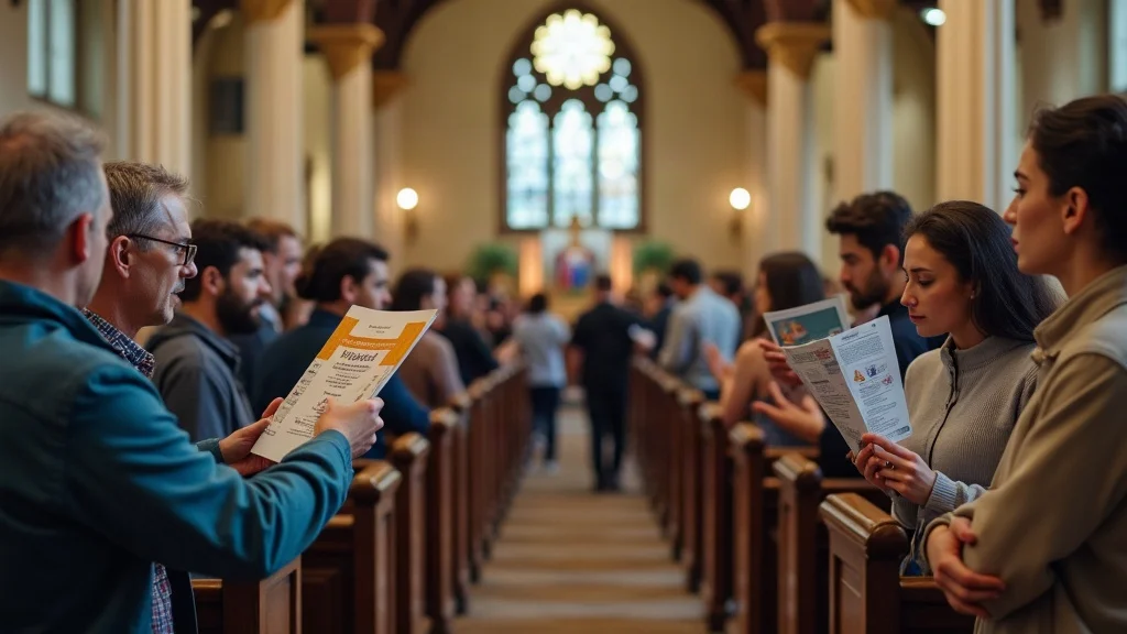
The Branding Epiphany: Unifying Visuals Create Trust and Open Doors
The turning point for many churches comes when they realise branding is not about ego—it’s about clarity. A church branding guide is simply a tool that helps every touchpoint tell the same story. Once that clicks, leaders stop seeing design as decoration and start seeing it as ministry alignment.
Every flyer, slide, post, and sign becomes another puzzle piece that clearly belongs to the same picture. People who have never set foot in your building begin to recognise your church by sight. Members feel a sense of shared identity. Visitors experience coherence from car park to coffee area.
Every touchpoint—sign, flyer, or post—becomes a piece of your faith story.
Dan Nichols
Real Results: How Homegate Evangelical Church Transformed Community Engagement
Homegate Evangelical Church is a great example of what happens when a church commits to cohesive branding. When they first approached me at Church Graphic Design, their communications were like many churches I see: sincere, busy, but visually inconsistent. The logo changed size and placement from piece to piece, colours varied across print and web, and each ministry had its own style.
We worked together to create a simple but robust church branding guide and then applied it everywhere. That meant clear decisions up front—fonts, colour palette, logo rules—and then a commitment to use them across every channel and ministry.
Adopted a professional church branding guide. We documented fonts, colours, logo usage, and basic layout rules in a format their whole team could understand and refer to.
Consistent visuals across print, online, and signage. Their website, Sunday slides, printed flyers, external signage, and social media posts all began to share the same visual language.
Result: unified message, higher recognition, and increased involvement. Over time, people in the community started saying, “I’ve seen your stuff around town.” Members found it easier to invite friends because everything looked more trustworthy and clear. Ministries that had felt “on the fringe” visually were pulled into a single, recognisable church identity.
Nothing about Homegate’s theology changed. Their heart for the gospel and the community was the same. What changed was the clarity and consistency with which that heart was presented visually—and the community responded.

The Trust Equation: Why Consistency Wins Hearts and Attendance
Trust rarely appears in a single moment. It’s built through repeated, consistent experiences over time. For churches, that trust-building journey often begins long before someone sits in a chair on a Sunday. It might start with a social media post, a notice in a community centre, or a banner outside your building.
If all those moments share a consistent visual language—same logo, same core colours, same font choices—people begin to feel like they already know you. That familiarity lowers the psychological barrier to visiting in person. They don’t feel like they’re stepping into the unknown; they feel like they’re finally visiting a place they’ve “seen around” for months.
Simple, consistent branding is the secret to being remembered—by everyone.
Dan Nichols
When your church branding guide is used faithfully, you communicate: “We know who we are. We pay attention to details. You can trust us with the things that matter. ” That quiet, visual credibility often makes the difference between someone scrolling past your event and someone deciding, “Let’s go. ”
Dan Nichols’ 3-Step Church Branding Framework: From Confusion to Clarity
A church branding guide doesn’t have to be a 60-page corporate document. In fact, for most churches, complexity is the enemy of consistency. The framework I use with churches is intentionally simple: make three key decisions, write them down clearly, and use them everywhere.
1. Choose 2–3 timeless fonts—and stick with them everywhere.
Pick one primary font for headings, one complementary font for body text, and (optionally) a third accent font if needed. Avoid trendy or overly decorative fonts that will age quickly or are hard to read. Once chosen, use them on your website, slides, flyers, signage, and social media. This one step alone dramatically unifies your visual identity.2. Select a simple, limited color palette.
Choose 2–3 core colours that reflect your church’s personality and context, plus a couple of neutrals (like dark grey and light grey or off-white). Document the exact colour codes (HEX or RGB) in your church branding guide so designers and volunteers use the same shades every time. Limiting your palette doesn’t restrict creativity; it creates a recognisable signature.3. Finalize your logo and use it consistently across all communications.
Decide on a primary logo and any approved variations (for example, a horizontal version and a simplified icon). Set clear rules: where it goes, how much space to leave around it, what backgrounds it can sit on, and minimum size. Then commit to using that logo consistently—no stretching, recolouring, or re-drawing. Your logo is the anchor for your entire visual identity.
Once those three ingredients—fonts, colours, logo—are settled and documented, you have the core of your church branding guide. From there, you can add examples of flyer layouts, social media templates, or photography style, but you don’t need to overcomplicate it to see real impact.

Bringing It All Together: Practical Tips for Everyday Church Communications
The real power of a church branding guide isn’t in creating it—it’s in using it. The churches that see the most transformation are the ones that bring their team along, build simple habits, and revisit their guide regularly enough to keep it alive and relevant.
Apply your branding guide to social media, flyers, bulletins, signage, and website.
Audit your existing materials and start updating them piece by piece. When you design anything new, open your church branding guide first and check fonts, colours, and logo rules before you start.Train volunteers and staff on consistent visual usage.
Don’t keep your branding guide hidden on one person’s hard drive. Share it with your whole team. Walk volunteers through it in a short training session. Show “before and after” examples so they can see why it matters.Review annually to keep your brand fresh but familiar.
Once a year, sit down with your guide and ask: “Is this still serving us? Is anything unclear? Are we drifting from our own rules?” You’re not trying to reinvent your brand every year; you’re making small refinements while preserving the core visual identity people have learned to recognise.

Your Next Step: Transform Church Communication—Start with a Free Discovery Discussion
If your church materials currently feel like a box of unmatched puzzle pieces—different styles, colours, and logos depending on who made them—now is the moment to change that. A clear, practical church branding guide can turn that confusion into clarity, and that clarity into real connection with your community.
You don’t need a huge budget or a massive team. You need a simple framework, the right decisions about fonts, colours, and logos, and a commitment to use them consistently across every ministry and channel.
If you’d like help creating or refining your church branding guide, I offer a free discovery discussion where we look at your current communications, identify the biggest wins, and map out what a cohesive visual identity could look like for your context.
Ready to make your message memorable? Visit churchgraphicdesign.co.uk or email me at dan@churchgraphicdesign.co.uk to book a conversation and start building a brand that truly reflects your church’s heart.
As you continue to strengthen your church’s visual identity, consider how your branding can be a reflection of your core beliefs and values. For a deeper dive into the foundational principles that shape your church’s message and mission, explore our insights on what we believe as a church community. This broader perspective can help you align every aspect of your communication—from design to doctrine—ensuring your church’s story is both visually compelling and spiritually authentic.


Write A Comment