


Your Logo Is Preaching – Even When You’re Not: The Hidden Power of the Church Logo Audit
Most churches don’t realise their logo is communicating something long before anyone hears a sermon. Long before anyone sits under your preaching, joins a small group, or even steps through the doors, your logo and visual identity are already shaping their expectations of your church, your community, and even the gospel you proclaim.
The "church logo audit" is not a familiar phrase for most church leaders. Many have never heard of an audit of a church logo at all. Yet this simple, structured review of how your logo aligns with your mission can be the difference between visual confusion and a clear, welcoming invitation to hear the good news of Jesus.
At its heart, a church logo audit is not about fonts, colours, and clever graphics. It begins much deeper. It starts with questions: Who are we as a church? What do we believe God has called us to do here? Who are we seeking to serve—inside the church family and in the wider community? Only when that foundation is clear does it make sense to talk about shapes, symbols, or styles.
Many churches underestimate how their logo communicates before visitors hear any verbal message.
Logos treated as mere decoration instead of a strategic tool
Skipping the foundational audit of aims, values, and audience
Focusing on colours and graphics before purpose
Underestimating the logo’s effect on clarity, welcome, and trust
When a logo is misunderstood or misused, the result is almost always the same: confusion, a blurred identity, and a missed opportunity to extend a warm and clear invitation to the community you long to reach. If the church logo audit is ignored, the logo silently works against the very mission it is meant to support.
Where Church Logos Go Wrong: Avoiding Confusion, Clutter, and Obscurity
Dated Designs and Clashing Visuals: Instant Warning Signs
Common problems identified in church logo audits are not usually theological; they are practical. Logos are often trying to say too much with too many elements—shields, doves, flames, crosses, waves, buildings, and Bible verses all squeezed into one small graphic. On a screen or a sign, the result is cluttered, cramped, and hard to read.
Another frequent problem is inconsistency. The same church might have one version of the logo on the website, another on the noticeboard, and a slightly different one on social media. Colours shift, fonts change, proportions wobble. Over time, this erodes trust and recognition, even if the congregation hardly notices it consciously. Your community simply feels that things are a little messy, a little unclear.
Then there is the issue of dated design. Certain styles, gradients, 3D effects, and clip-art style icons instantly root a logo in a particular decade. What once looked modern now feels tired or even amateurish. When that happens, people unconsciously transfer that feeling onto the church itself: if the logo feels out of date, perhaps the church and its message are out of date too.
Inconsistent branding across platforms
Trends that quickly become outdated
Overcomplicated symbols and hidden meanings
Generic templates that fail to reflect a unique church identity
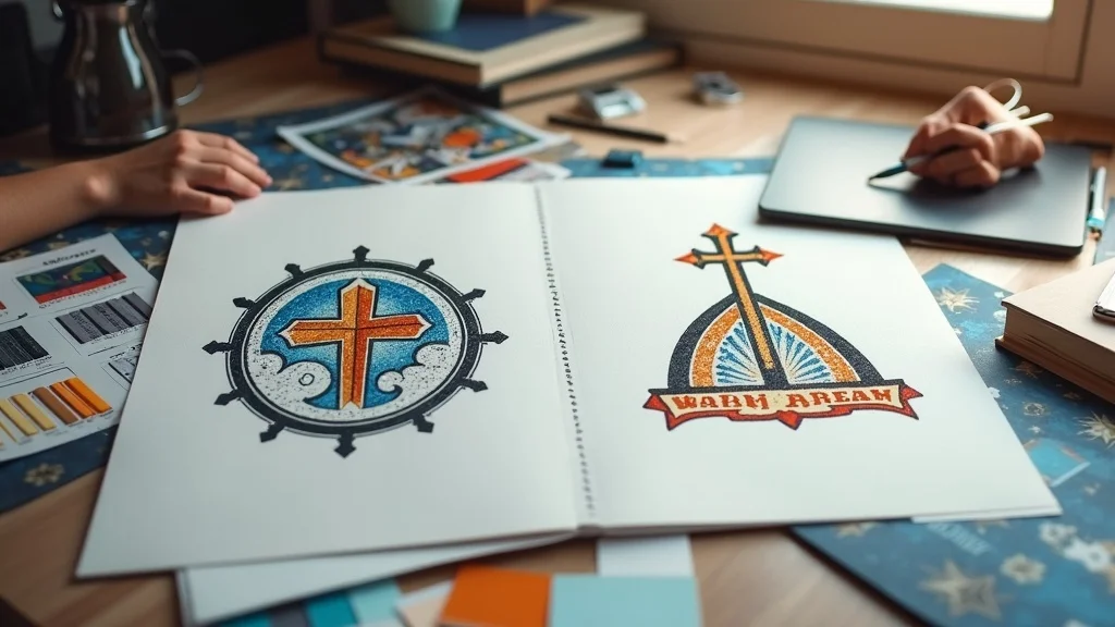
A confused logo is a closed door—keep the invitation clear.
Dan Nichols BSc, Church Graphic Design (CGD)
The audit almost always reveals one or more of these pitfalls. None of them are beyond repair, but ignoring them leaves a quiet barrier between your church and the people you hope to welcome.
While addressing these visual challenges, it's also helpful to consider how your church's overall branding strategy can support a more unified and welcoming presence. For practical steps on aligning your church's visual identity with its mission, you might find it valuable to explore how intentional time and clarity in communication can transform relationships and engagement—principles that apply just as much to church branding as they do to family life.
The Clarity Test: Is Your Logo Building Trust or Blurring Your Message?
An effective church logo doesn’t need to be clever; it needs to be clear. A useful clarity test involves asking: if someone saw your logo on a flyer, a phone screen, or a roadside banner for just a second or two, would they recognise it the next time they saw it? Would they get a sense that this is a warm, trustworthy, gospel-centred community worth exploring?
Trust is built through repetition and consistency. If your logo appears slightly differently on every platform, it never has the chance to become familiar. If it is too detailed, it falls apart when it is reduced to a small size. If it tries to communicate every ministry and every doctrine visually, it ends up communicating nothing clearly. In that sense, a blurred logo often leads to a blurred message.
A strong church logo passes four basic tests of effectiveness. It is instantly recognisable, even at a small size. It appears consistently across digital and physical spaces. It feels aligned with your mission and values, not borrowed from a random template. And it communicates a welcoming tone that speaks not just to current members but to the neighbours who have never yet visited.
Instantly recognisable in digital and physical spaces
Consistent use everywhere (social, signage, print)
Aligns with church mission and values
Welcoming tone that reaches beyond the church family to the local community
When walking a church through the church logo audit to identify what makes a logo effective (and check factors that usually go wrong), this clarity test is often the turning point. Leaders suddenly see that the issue is not just aesthetics; it is whether the logo is quietly building trust or quietly undermining it.
The Epiphany: Why an Audit Changes Everything - The “Foundations First Framework”
Before Design—Define: Linking Vision, Values, and Visuals
The biggest misconception many churches have about design is that it starts with the designer. In reality, good church logo design starts with the church. Before talking about icons, colours, or typography, we must ask leaders to slow down and define what God has called them to be and do in their particular context.
A structured foundations-first approach focuses on mission and values before visual design elements. It begins as a guided conversation, not a design session. We talk about your aims, your values, your theology, your community, and the particular people you long to reach—students, families, older generations, those on the margins, or a mixture of all. These discussions are often as valuable for the leadership as the final logo itself.
Only once that foundation is in place do we begin to translate those ideas into visuals. This is where the church logo audit: "what makes a logo effective (and what usually goes wrong)" really does its work. Instead of asking, “What looks nice?” we ask, “What most clearly and faithfully serves the gospel we’re trying to communicate here?”
Great church design doesn’t distract—it clarifies the gospel.
Dan Nichols BSc, CGD

The Foundations First Framework: Building Church Logos That Last
An effective church logo audit typically follows a structured sequence. Each step is designed to uncover what makes a logo effective and expose what usually goes wrong, long before the first concept is drawn. An effective audit process typically includes these steps.
1. Purpose: A deep-dive into mission, values, goals, and theology. What are you actually here for? What do you want people to understand about Christ and his church as they encounter you for the first time?
2. Audience: Who are you trying to reach—both inside and beyond the church? How might a newcomer discover you: Google search, social media, a banner on the railings, a flyer through the door?
3. Alignment: Ensuring the logo style genuinely supports real-world ministries. A church with a strong youth focus might need a different visual energy from a small rural fellowship, but both can be clear, warm, and Christ-centred.
4. Simplicity: Designing for clarity across all platforms. If a logo doesn’t work at small sizes on a phone, or in black and white on a photocopied notice sheet, it is not yet simple enough.
5. Consistency: Creating a clear set of guidelines so the logo, colours, and fonts are used the same way everywhere, reinforcing trust through unified visuals.
Effective logo audits ensure design decisions align with organizational mission and values. The outcome is not just a “nice logo” but a visual identity that can serve your church for years without feeling dated or disconnected from your real life together.
Real-Life Transformation: A Story of Visual Renewal

Here's an example to illustrate... A church we know had a particularly cluttered and confusing logo. It had grown organically over the years—elements added here and there, slightly altered for different events, stretched on one banner, squashed on another. The heart of the church was warm, faithful, and outward-looking, but you wouldn’t have known it from the visuals.
During a comprehensive logo audit, church leadership teams typically explore their values and community context to explore their values and the community they serve. This brings what matters most to them to the surface - being clearly Bible-centred, genuinely welcoming across generations, and visibly rooted in their local community. None of that was reflected in their existing logo or branding.
This process often leads to developing a new visual identity that is simple, readable, and flexible, built from the ground up using our Foundations First Framework. The logo will then work cleanly on their website, Sunday slides, outdoor banners, and printed invitations. Within a few months they would notice a measurable rise in newcomer engagement—people who said they had found the church online or felt confident attending a service because the visual presence felt clear, approachable, and trustworthy.
Context: A church with a dated, cluttered, and confusing logo
Audit Process: Mission, values, and community needs brought to the surface; misalignment between heart and visuals identified
Result: A clear, unified, and inviting new visual identity—and with it, increased clarity in communication and more first-time visitors arriving through the doors
This example reinforces our belief that design is not cosmetic. When used well, the church logo audit: what makes a logo effective, becomes a tool God can use to remove unnecessary barriers to people hearing about Christ.
Practical Next Steps: How to Clarify and Improve Your Church Logo Right Now
You do not need to be a designer to take the first steps towards a healthier logo and visual identity. A simple self-assessment, done honestly, can already begin your own church logo audit and reveal what makes your logo effective—or what usually goes wrong.
Assess: Look at your current logo on your website, noticeboard, social media, and handouts. Does it align with who you are and what you believe God has called you to do?
Engage: Invite a small group of leaders and volunteers into a discussion. Ask them what the logo communicates to them, and what they think it might communicate to someone who has never been to church.
Consult: Speak with a church design expert who understands both design and church life. A short conversation can often prevent years of frustration and avoidable mistakes.
Review: Once you settle on a logo, ensure every touchpoint—banners, website, social media, printed materials—uses the same version, colours, and style.
Even these simple actions can help you begin your own logo audit and move your church towards greater clarity and welcome.
Modernising Without Losing Tradition: Achieving Balance in Church Branding

One of the most common strategic questions we hear is, “How can we modernise our logo without losing our heritage?” It is a good and necessary question. Many churches rightly want to honour their history and older members while also speaking clearly to younger generations and those with no church background at all.
The answer is not to cling rigidly to the old nor to chase every new trend. Instead, it is to identify which elements of your visual identity genuinely carry tradition and meaning, and which are simply habits of style. A cross, a particular architectural silhouette, or a colour linked to your building may be worth keeping. But heavy, unreadable fonts, cluttered shields, and clip-art flames are usually not.
Honour core elements that genuinely connect with your heritage
Update with clarity and simplicity in mind, not fashion for its own sake
Evolve language and imagery so that someone from your community today can understand and relate
Keep Christ at the centre—whatever the style, ensure the visuals ultimately serve the proclamation of the gospel
A systematic audit approach can provide helpful framework. It allows you to hold tradition and mission together thoughtfully, rather than choosing one at the expense of the other.
Church Logo Audit FAQs: What Church Leaders Ask Most
What’s the difference between a logo and branding?
How often should a church update its logo?
Can a small church afford professional design?
What’s the biggest risk of neglecting a logo audit?
What’s the difference between a logo and branding?
A logo is a single visual mark—often a symbol, wordmark, or combination of both. Branding is the wider system of how your church presents itself visually and verbally: colours, fonts, imagery, tone of voice, and the way everything fits together. In a healthy church logo audit, we look at the logo and the broader branding together, because even a strong logo can be weakened if it sits inside a confused or inconsistent wider identity.
How often should a church update its logo?
There is no fixed timetable, but in general, a well-designed logo should last many years. Best practices suggest reviewing logos and branding every five to seven years as part of a broader church branding audit, asking whether it still serves your current context and ministries. A refresh may be needed if your logo feels dated, no longer aligns with your mission, or struggles to work well across digital platforms.
Can a small church afford professional design?
Smaller churches often assume that professional design is beyond their budget, but research suggests effective design prioritises clarity and purpose over complexity. A simple, well-thought-through logo and basic brand toolkit can be surprisingly affordable and will serve you far better than a patchwork of free templates. When you weigh the long-term impact on clarity, welcome, and trust, careful investment guided by a church logo audit often saves time and money in the long run.
What’s the biggest risk of neglecting a logo audit?
The biggest risk is not that people will dislike your logo; it is that they will never clearly understand who you are and whether your church is a place they could belong. Without the church logo audit, many churches drift into visual confusion—mixed messages, inconsistent use, and a vague, generic presence that blends into the background of the community.
Key Takeaways: Does Your Logo Communicate Clarity, Welcome, and Relevance?
Is your logo instantly recognisable, even at a glance and at a small size?
Does it communicate your church’s heart, mission, and theological centre?
Is it working for you—building trust, clarity, and welcome—or quietly working against you by creating confusion?
If you are unsure about any of these, that is your invitation to pause and consider a more intentional church logo audit for your particular context.
Ready to Transform Your Church’s Identity?

My conviction is simple: design should serve the gospel, not overshadow it. A clear, thoughtful church logo and visual identity can help more people feel confident enough to walk through your doors and listen to the message of Christ. It is not about slick marketing; it is about removing unnecessary barriers to hearing good news.
Churches considering logo updates should evaluate whether their current visual identity effectively supports their mission and community outreach goals
If you would value a conversation about your own logo in your setting, we would be glad to help. Together we can explore your mission, your context, and your existing visuals, and begin shaping an identity that genuinely reflects who you are and who you hope to reach.
The closing question we'd encourage every leadership team to ask is this: does our church visually communicate clarity, welcome, trust, and relevance? If the honest answer is “I’m not sure” or “probably not,” now is the time to act.
____________________
For those seeking even deeper insight into church branding and visual communication, consider checking out Why Church Logo Design Matters for a comprehensive look at the theological and psychological impact of church logos in outreach and identity.
Similarly, Church Logo Design Best Practices offers actionable guidelines and real-world examples that will help you assess and elevate your church's visual identity.
If you’re serious about mastering the Foundation First Framework for Church Logo Audit: what makes a logo effective, these resources will give you both foundational insight and practical tools for lasting improvement.
____________________
Dan Nichols BSc is the Founder and lead Graphic Designer at Church Graphic Design based in Chesterfield, UK
Business Interest Disclaimer
Published by Ken Johnstone MBA BSc, Executive Editor at DDM Smart Marketing and Biblical Living Unlocked


Write A Comment