


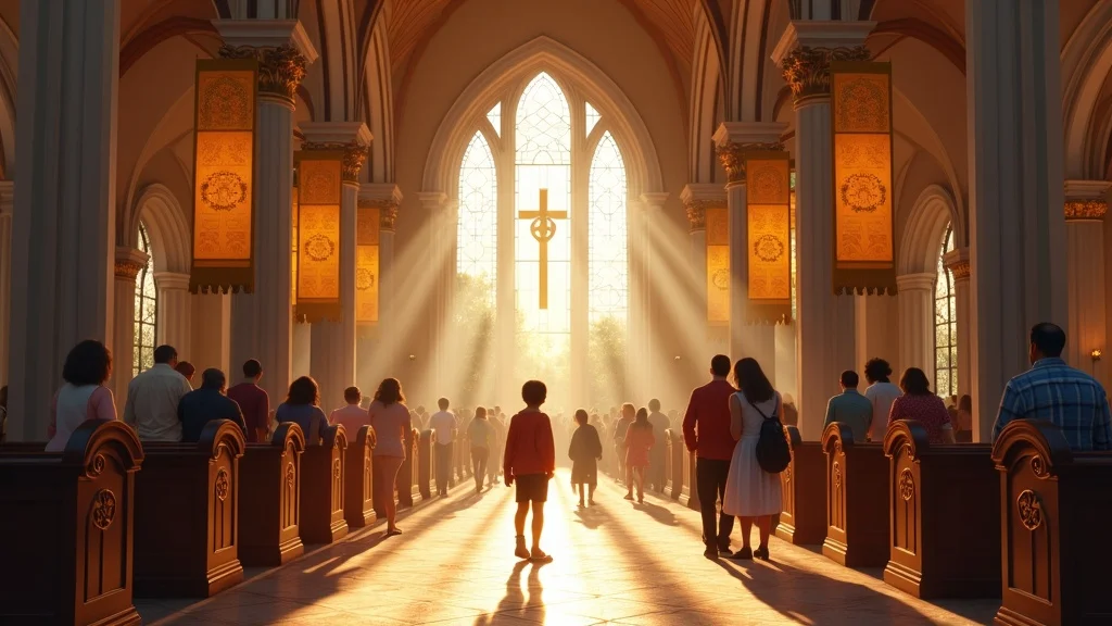
Every church carries a story—formed over years of faithfulness, shaped by people, place, and purpose. The challenge today isn’t whether that story should change… but whether it’s still being clearly understood.
When you sit down with church leaders, they rarely say, “We want to become a completely different church. ” More often, they say, “We know who we are, but people don’t seem to get it anymore. ” That gap—between how a church sees itself and how others experience it—is where identity starts to fray.
Modernising a church identity while honouring tradition isn’t about swapping stained glass for LED screens or hymns for haze machines. It’s about stewarding what God has already been doing in your church, and communicating that story with clarity in a world that’s overloaded with messages.
In other words: the real issue is not “modern vs traditional”. It’s clarity vs confusion.
When churches confuse clarity for novelty, their message fades.
Dan Nichols - Church Graphic Design (CGD)

Why Church Branding Fails: The Clarity Gap Killing Your Identity
Most church branding doesn't fail because it's old-fashioned. It fails because it's unclear. When working with churches, you'll consistently observe them pouring energy into new logos, websites, and colour palettes, only to discover that visitors are still unsure what the church actually believes, who it's for, or how to get involved.
That’s the clarity gap: when the visual and verbal story people encounter doesn’t match the reality of your church family. What factors are likely to contribute to the clarity gap:
Perception vs reality: why first impressions often miss your real story
How hidden design choices confuse visitors and hinder connection
The silent sabotage of over-complication in church communication
For churches seeking practical steps to bridge this clarity gap, exploring the essentials of branding and logo design for churches can provide actionable guidance on aligning your visual identity with your core message. Understanding these foundational elements helps ensure that every touchpoint, from signage to digital presence, consistently reflects who you are.
Perception vs Reality: The Welcome People Actually Experience
Ask a church leader to describe their church and you’ll hear words like “warm”, “family”, “Bible-centred”, “welcoming to everyone”. But when you conduct a first-time visitor assessment—standing in the car park on a Sunday with someone new—what they experience may be very different.
Your assessment process should identify whether visitors drive past the building multiple times because signage is tiny, faded, or hidden behind hedges. You'll discover if people walk in uncertain about where to take their children, where facilities are located, or even where the main entrance is. None of this is caused by bad theology or a lack of love—it's caused by unintentional communication.
In design terms, these are “first-contact moments”: the visual and practical cues that either confirm or contradict what you believe about yourself. When those cues are unclear, your church rebranding, logo, or modern church design work is fighting an uphill battle before the service even starts.
How Hidden Design Choices Create Confusion
Most churches don’t realise how much they’re communicating—without saying a word. The typeface on your notice sheet, the colour of your walls, the consistency (or inconsistency) of your church logo design, the way your service times appear online—these all shape expectation.
When conducting design audits, you should look for three hidden design issues that appear consistently:
Inconsistent visuals: one style on the website, another on printed materials, a third on PowerPoint. People subconsciously feel disjointedness before they even name it.
Insider language everywhere: “Join us in the vestry after the breaking of bread” might make perfect sense to your members, but a guest probably has no idea what that means.
Cluttered communication: posters, banners, and screens crammed with too much information, leaving people unsure what really matters.
Each of these quietly tells newcomers: “This isn’t really for you—you’re expected to already know how this works.” That’s the opposite of the gospel impulse to welcome and explain.
The Silent Sabotage of Over-Complication
Over-complication is one of the kindest mistakes churches make. The heart behind it is usually good: “We have a lot going on; we don’t want anyone to miss anything.” But the effect is that people end up seeing everything and remembering nothing.
On a practical level, this shows up in church communication strategy as notice sheets packed with tiny text, slide decks with ten announcements in a row, and websites where every ministry fights for equal prominence on the homepage. It feels fair—but it isn’t helpful.
Clarity is not about saying everything. It’s about making it obvious what matters most right now. A clear hierarchy of information—what’s primary, what’s secondary, what can wait—serves both your church family and your guests. Modernising a church identity while honouring tradition often begins with the simple courage to say less, more clearly.
Clear design isn’t about looking modern—it’s about making Christ unmistakable.
Dan Nichols, CGD

From Disruption to Stewardship: Your Visual Identity as Ministry, Not a Trend
Whenever a church talks about updating its identity, there’s usually a quiet fear in the room: “Are we about to lose who we are?” That fear is understandable—and in many cases justified—because design has often been treated as disruption: out with the old, in with the new.
The recommended approach treats church branding, church logo design, and modern church design not as tools for reinvention, but as tools for stewardship. Your story doesn’t need to be reinvented. It needs to be translated.
The Epiphany: Clarity, Not Change, Unlocks Lasting Connection
When working with churches requesting complete rebrands, your process should begin with comprehensive listening rather than immediate design work. For example, when a church feels tired, outdated, and disconnected from younger families in their area, they often assume they need a new name, totally different logo, and radical style shift.
Your discovery process should involve speaking with long-standing members, new Christians, teenagers, and parents of young children. You'll consistently hear stories of faithful preaching, quiet acts of service, practical care in times of crisis, and genuine "all-ages family" atmosphere in congregations.
Your assessment will typically reveal that the issue isn't their identity—it's how that identity is being expressed. Existing logos often have elements people love, but they're used inconsistently. Websites don't reflect the warmth visitors feel when they walk through the door. Signage confuses rather than guides. Once you simplify existing visual language and align it with clearer communication strategy, you'll observe something powerful: people begin to recognise themselves in the visuals.
The church didn’t become something new. It became more clearly itself.
The Clarity-Continuity Method: A 3-Step Approach for Authentic Church Identity
1) Listen Deep: Audit what your church family believes and feels. Before drawing anything, your process must prioritise listening. You should discover what people cherish, what they're proud of, what God has been doing over decades, and what newer members notice first. This isn't just about preferences; it's about values, theology, and culture.
2) Discern Wisely: Identify what's essential and what's just habit. Not everything old is sacred, and not everything new is suspect. Your role is to discern which visual and verbal elements actually carry meaningful tradition, and which are simply "how we've always done it". Faithfulness means keeping what serves the gospel clearly—and being willing to release what doesn't.
3) Shape Purposefully: Design visuals that translate, not transform, your story. Only after listening and discerning should you begin to design. The goal is continuity—so that your church family recognise themselves in the updated identity—combined with clarity, so that newcomers can quickly grasp who you are and how to connect.
This is what separates a church rebrand driven by trends from one shaped by stewardship. One chases relevance; the other pursues clear, Christ-centred communication.
Small Changes, Massive Impact
Your intervention process should recognise that not every church needs dramatic rebranding. Sometimes the most effective shift is wonderfully ordinary. For example, when working with churches struggling to connect with visitors where people arrive late or flustered, unsure where to park or which door to use, leadership often assumes they need completely new visual identity.
Your site visit should immediately identify core problems: nothing outside the building explains what's happening inside. You'll notice absence of clear welcome points, obvious entrances, and information for guests. Your solution might start with one simple change: a clean, well-designed welcome sign positioned outside, using plain language, service times, and a simple "You're welcome—start here" message.
Your approach should prioritise clarity over flashiness. Within a few weeks, the church began hearing the same comment from new people: “We knew exactly where to go. ” That one piece of modern church design, rooted in clarity rather than trend, doubled the number of people who made it from car park to coffee without feeling lost.
Breaking Free from the Status Quo: Tradition as Gateway, Not Barrier
Tradition is not the enemy of clarity. In fact, meaningful tradition can be one of your strongest assets when modernising a church identity while honouring tradition. The problem is not that churches have traditions; it’s when those traditions are hidden, unexplained, or visually inaccessible to people who didn’t grow up with them.
Tradition’s strength is its meaning—not its form.
Dan Nichols, CGD

Good intentions can create barriers if traditions aren’t explained visually or verbally.
Case study: When holding onto a beloved logo caused confusion with newcomers, a subtle update helped people belong.
How to preserve your ‘storyline’ through thoughtful church logo design and messaging without alienating anyone.
When Good Intentions Become Barriers
You'll encounter churches holding onto beloved logos or design styles for all the right reasons. Perhaps a member designed it years ago, or it reflects a particular moment in the church's history. The heart behind keeping it is loyalty and gratitude.
Your assessment should identify when logos reproduce poorly, are impossible to read on digital platforms, or carry imagery that confuses people (for example, a symbol that means one thing to older members and something entirely different online). What once served clarity can now create distance.
Your solution approach should preserve meaningful elements while improving functionality. For instance, when working with churches using very detailed crests as primary marks that long-standing members love but newcomers don't recognise as logos, you can simplify core shapes into modern church logo design that's legible at small sizes and works across print and web. The original crest can be retained for special occasions and historical materials. Tradition remains—but its form is adjusted to serve clarity.
Preserving Your Storyline Through Design
Whenever you guide churches through church rebranding, you should identify the "storyline" that must not be lost. That might be a cross that's always been central, colours linked to the church's location, or a phrase in their mission statement that people quote often. These become anchors.
Your thoughtful church logo design and communication strategy should take those anchors and build around them in ways people can easily understand today. For example:
Pairing a historic symbol with simpler typography so it feels both rooted and readable.
Using a modern colour palette that still echoes tones found in your building’s stone, stained glass, or surroundings.
Explaining traditions on your website and printed materials in plain language, so guests understand not just what you do, but why.
Your approach should make tradition a gateway to the church's story, not a closed door that only insiders can walk through.
Actionable Tips: Modernising Church Identity Without Losing Your Soul
Modernising a church identity while honouring tradition doesn’t have to be overwhelming. You don’t need to solve everything at once, and you certainly don’t need to become a design expert overnight. Here are practical steps you can begin this month.
Start with listening: Gather stories from your church family and first-time visitors.
Ask people what first drew them in, what they remember from their first Sunday, and what they tell friends about your church. Ask visitors what confused them, what helped them, and what they noticed first. This gives you real insight, not assumptions.Audit for friction: Identify where visual and verbal cues block understanding.
Walk your building and your website like a guest. Is it obvious where to go, what to do, and what to expect? Are service times, children’s provision, and contact details easy to find? Anywhere you feel unsure, your guests will too.Prioritise simplicity: Every element should serve a purpose. If it doesn’t, re-evaluate.
In your church communication strategy, ask of every slide, poster, and webpage: “What do we want someone to do or understand because of this?” If you can’t answer clearly, simplify or remove it.Involve the right voices: Empower both long-time members and newcomers in the feedback process.
Honouring tradition means honouring the people who have carried it. Modernising wisely means listening to those just joining the story. Bring both around the same table when you consider changes.Partner wisely: Seek designers who understand ministry realities—not just trends.
Church life is unique. Limited time, volunteer teams, tight budgets, and pastoral concerns all play a part. Work with people who get that, who see church design as ministry, not just as a portfolio piece.

Key Takeaways: Communicate Timeless Truth in Fresh Ways
Clarity bridges the gap between tradition and modern communication.
You don’t have to choose between being “modern” or “traditional”. You do have to choose whether you will be clear.Strong church identity is anchored, not trendy.
Trends come and go. Anchors hold. Your visual identity should be recognisable, repeatable, and rooted in who you are, not in what’s fashionable this year.True “modernisation” makes your message unmistakable—never just fashionable.
A clean, contemporary look is not the goal; it’s a byproduct of removing distraction. The real win is that people quickly grasp who you are and what you’re about.Your story’s power is in how clearly it’s understood.
The gospel hasn’t changed. Your church’s mission likely hasn’t either. What needs attention is how people encounter that story visually and verbally.
Ready to Modernise Your Church Identity Without Losing Who You Are?
If you feel the tension between honouring your past and serving people clearly today, you’re not alone—and you’re not stuck. You don’t need to abandon tradition to speak clearly into a modern world. You need tools, language, and visuals that translate your existing story faithfully.
Find your unique visual voice without compromise.
Don’t settle for a trend—build for lasting connection.
Transform Your Church's Communication Today
Get a free, practical action plan tailored to your church’s story.
Let your tradition shine—while serving today’s needs.
If you’re ready to explore what this could look like for your church, I’d love to help you listen well, discern wisely, and design with purpose—so that every notice, every sign, every slide, and every logo is working together to make Christ unmistakable.
Your story hasn’t changed—just how it’s understood. Clarity makes all the difference.
Dan Nichols, CGD
As you consider the next steps for your church’s identity, remember that effective branding is just one part of a strategic approach to church communication. If you’re interested in exploring how a unified branding and logo design strategy can support your mission and foster deeper connections, discover more about the principles and process behind impactful church branding. By investing in clarity and consistency, you’ll not only honour your tradition but also equip your church to engage your community with renewed confidence and purpose.
FAQs: Modernising a Church Identity While Honouring Tradition
How do we know if our church identity actually needs updating?
A good starting point is to compare what you believe about your church with what guests actually experience. If people frequently misunderstand your service times, struggle to find key information, or are surprised by what they find when they visit, that’s a sign your communication isn’t matching your reality. You may not need a full rebrand, but you almost certainly need to clarify how your story is being communicated visually and verbally.
Will modernising our church design upset long-standing members?
Change handled badly can cause hurt; change handled with listening and honour can actually strengthen trust. If you begin by listening to long-standing members, involving them in the process, and clearly explaining why certain changes are being made, people are far more likely to feel valued rather than sidelined. The goal is not to erase what they love, but to help what they love be understood by future generations.
What’s the difference between church branding and “just a logo”?
A logo is one visual mark. Church branding is the wider system of colours, typefaces, imagery, tone of voice, and behaviours that communicate who you are. A strong church branding approach ensures that your notice sheet, website, signage, and slides all feel like they belong to the same story. This consistency builds trust and makes it easier for people to recognise and remember your church.
How can we respect our historic building while using more modern visuals?
Your building is part of your story, not your whole story. You can honour its architecture by borrowing colours, shapes, or motifs from the space and blending them with clearer, simpler design elements. For example, using colours drawn from stained glass in a cleaner graphic style, or pairing a photograph of your building with modern, legible typography. This allows you to communicate in a contemporary way without pretending to be something you’re not.
We’re a small church with volunteers and a tight budget—where should we start?
Start with clarity, not complexity. You don’t need a massive budget to improve how you communicate. Focus on the basics: clear signage, up-to-date information on your website, readable notice sheets, and simple, consistent use of a logo and colour palette. Small, intentional changes in these areas often have more impact than expensive but unfocused design work.
How long does a thoughtful church rebranding process usually take?
The timeline depends on your size, decision-making structure, and scope, but a thoughtful process usually takes a few months rather than a few weeks. Time is needed to listen well, gather feedback, develop options, and implement changes at a realistic pace. Rushing may get you a new look quickly, but it rarely results in a church identity that truly honours your tradition and serves your future.
Can we keep parts of our old logo when we modernise our identity?
In many cases, yes—and often you should. If there are elements of your existing logo that people are fond of or that carry historical meaning, they can often be simplified, redrawn, or incorporated into a more flexible design system. This approach preserves continuity so your church family still recognises themselves in the updated identity.
__________________________
Dan Nichols BSc is the Founder and lead Graphic Designer at Church Graphic Design based in Chesterfield, UK
Published by Ken Johnstone MBA BSc, Executive Editor


Write A Comment