


When someone in your town is hurting, searching, or simply curious about faith, they don’t start with your welcome team, your pastor, or your building. They start with Google.
In 2025, the first visit to your church almost always happens online. And if your website looks outdated, thin on content, or confusing to navigate, most people will quietly walk away long before they ever walk through your physical doors.
This is why website design optimisation is no longer a “nice to have” for churches. It’s become a core part of modern ministry. A neglected website doesn’t just look unprofessional—it actively works against your mission, turning seekers away before they’ve had a chance to encounter Jesus or your community.
Why Outdated Websites Are Turning Seekers Away: The Hidden Enemy of Church Growth
First impressions happen online—yesterday’s website is today’s locked door.
Dan Nichols
I work with churches across the UK, and I see the same heartbreaking pattern again and again. The church is warm, Bible-centred, welcoming, full of genuine community. But the website? One outdated page, blurry images, no clear information, and no sense of life.
In the digital age, churches aren’t just compared to other churches. They’re compared to every organisation with a professional online presence: schools, charities, cafés, gyms, community groups. When your website feels ten years behind, people subconsciously assume the church is ten years behind too.
If someone lands on a single, static page with small text, stock clip art, and an old sermon from three years ago, they don’t think, “This church is busy doing ministry. ” They think, “This church is dying, disorganised, or irrelevant. ” That happens in seconds—long before anyone reads your statement of faith or watches a sermon.
This is the hidden enemy of church growth: not atheism, not secularism, but poor first impressions created by neglected websites.
The High Stakes of Website Design Optimisation for Churches
-
How a church website shapes first impressions and trust
Your website is your digital welcome area. Within 5–7 seconds, visitors decide if your church is trustworthy, relevant, and worth exploring. Clean design, clear information, and a warm tone communicate care and credibility. A messy or dated site suggests the opposite, even if it’s not true in reality. -
Why digital visitors decide in seconds to engage or leave
People today scan, they don’t study. If they can’t immediately find your service times, location, kids’ provision, or what you actually believe, they leave. Website design optimisation is about making it delightfully easy for a first-time visitor to say, “I get this church, and I think I’d be welcome here.” -
The competitive landscape: churches aren’t just competing with churches
Your website sits in the same browser tabs as YouTube, Netflix, and the local community hub. That’s the standard for usability and visual quality your site is unconsciously measured against. You don’t need to be flashy, but you do need to be clear, current, and visually credible if you want people to stay long enough to encounter the gospel.
One often-overlooked aspect of building trust online is how clearly your church communicates its core beliefs. Ensuring your website features a concise and accessible summary of what your church believes can help visitors quickly understand your identity and values, making them more likely to take the next step toward real engagement.
Building Real Engagement: How to Make Your Website the Center of Community Connection
A professional website isn’t about flash. It’s about opening doors to real relationships.
Dan Nichols
Good design isn’t about being trendy; it’s about removing barriers. When I talk about website design optimisation for churches, I’m not thinking in terms of slick gimmicks. I’m thinking in terms of discipleship pathways.
Every element of your website should answer two questions: Who are we? and What is the next step for you? That might be visiting on Sunday, filling out a contact form, joining a small group, watching a sermon, or simply reading about Jesus for the first time.
If your “digital front door” is confusing or lifeless, people won’t knock. But when your site feels like a genuine invitation into a living community, people are far more likely to take a step toward you—and ultimately, toward Christ.

The Church Impact Framework: Attract, Engage, Empower
-
Attract: Visually compelling visuals & modern layouts
Before anyone reads a word, they feel your site. Is it calm, cluttered, cold, or warm? Using modern layouts, readable fonts, and quality images is a crucial part of website design optimisation. Clean spacing, consistent colours, and clear headings show that you care about excellence and about the people visiting. -
Engage: Clear mission, vision, and ‘next steps’ opportunities
Once they’re drawn in, they need to know who you are and what you’re about. Share your mission and vision in plain, human language—not just theological jargon. Then offer simple, visible next steps: “Plan Your Visit”, “Ask for Prayer”, “Join a Group”, “Explore Christianity”. Engagement grows when people are invited, not left to guess. -
Empower: Real-life photos, authentic video sermons, social media integration
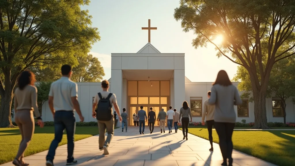
This is where your website stops feeling like a brochure and starts feeling like a community. Use real photos of real people in your church, not generic stock images. Embed authentic sermon videos so people can hear your teaching and see your worship. Link to active social media accounts so visitors can see day-to-day church life. This kind of visual storytelling builds trust and shows that your church is alive, relational, and engaged in its community.
Showcase people, not just programs. Authenticity wins hearts—and second visits.
Dan Nichols
Quick Wins for 2025: Website Design Optimisation That Moves the Needle Immediately
Many leaders feel overwhelmed by the idea of improving their website, especially if budgets and teams are small. The good news is that you don’t need a complete rebuild to see a real impact. A handful of focused changes can dramatically improve how people experience your church online.

-
Update your homepage with real photos of congregation and events
Swap out clip art, empty buildings, or outdated shots for bright, recent images of your people worshipping, serving, and enjoying community. This single step transforms the tone of your site from institutional to relational. It’s one of the simplest, most powerful forms of website design optimisation. -
Embed recent sermon videos and genuine testimonials
Add 2–3 of your latest sermons directly on the homepage or a clearly linked “Messages” page. Include short written or video testimonies from real members sharing how Jesus has changed their lives and how the church has supported them. Stories cut through noise; they help visitors imagine themselves in your community. -
Link out to active social media profiles
If you’re posting regularly on Facebook, Instagram, or YouTube, make those links obvious. This helps potential visitors see what happens beyond Sunday and reassures them you’re active and engaged. If a platform is dormant, either revive it or remove the link so it doesn’t send the wrong message. -
Use clear calls to action—volunteer, visit, connect
Don’t assume visitors will know what to do next. Add prominent buttons like “Plan Your Visit”, “Contact Us”, “Ask for Prayer”, or “Serve on a Team”. Each clear call to action turns a passive viewer into someone on a journey. -
Keep content current: a moving calendar, fresh updates, timely blog posts
A homepage advertising a Christmas event from two years ago quietly tells people you’re not paying attention. Keep your events calendar updated. Post brief updates or reflections occasionally. Even one meaningful post per month signals that your church is alive and paying attention to its online presence.
Frequently Asked Questions: Demystifying Website Design Optimisation for Churches

-
What should every church website include?
At a minimum, a strong church website should clearly show service times, location, basic beliefs, what to expect on a Sunday, and how to contact you. From there, add key ministries (kids, youth, small groups), recent sermons, and a simple next-step pathway. These essentials make your site genuinely useful for both members and first-time visitors. -
How can we measure if our website is working?
Start by tracking simple metrics: how many people visit the site, which pages they view most, and how many use contact forms or “Plan Your Visit” links. Ask first-time visitors how they found you and what helped them decide to come. When website design optimisation is working, you’ll see more informed guests arriving and more people taking next steps without needing everything explained from scratch. -
How much content is too much?
You don’t need to publish everything your church has ever done. Focus on clarity, not volume. If content helps a visitor understand who you are, what you believe, or what to do next, it’s valuable. If it’s long, outdated, or repetitive, archive it. A lean, well-organised website serves people better than a sprawling maze of old pages. -
What’s the simplest way to keep our site fresh?
Assign one person (staff or trusted volunteer) to be responsible for updates and give them an easy process. Set a monthly reminder to refresh key areas: events, homepage highlights, and sermon list. Regular small tweaks are far more sustainable—and more effective—than waiting for a big overhaul every few years. -
Why does visual storytelling matter for churches?
People connect with faces and stories long before they connect with statements and structures. When you use real photos and videos of your church family, you’re not just decorating a page; you’re showing the gospel at work in real lives. Visual storytelling turns abstract ideas like “community” and “welcome” into something visitors can actually see and feel.
Transforming Your Church’s Digital Presence: Next Steps and Where to Get Help
In 2025, a church’s website is not an afterthought—it is the invitation.
Dan Nichols
If your website currently feels like a digital noticeboard from 2012, you’re not alone—and you’re not stuck. Every church, regardless of size or budget, can take meaningful steps toward better website design optimisation this year.
Begin with the basics: update your homepage images, clarify your Sunday information, tidy your navigation, and add clear next steps. Then gradually build in richer elements like video sermons, testimonies, and integrated social media. Think of your site not as a static brochure, but as a living extension of your ministry.
If you feel unsure where to start or short on time, this is exactly the kind of work I help churches with at Church Graphic Design. Whether you need a full redesign or just expert eyes on what you already have, getting outside input can save you years of trial and error and help your church put its best, most faithful foot forward online.
Key Takeaways: Website Design Optimisation Essentials for Church Leaders

-
Website design is mission-critical, not optional
Your website is now your most frequently visited “room.” Treat it as a core ministry tool, not a side project. -
Visual authenticity and engagement increase connection and trust
Real photos, clear language, and simple navigation show people they matter and that your church is active, approachable, and safe to visit. -
Intentional next steps turn digital visits into real-life relationships
Don’t just inform people—invite them. Clear calls to action move people from curiosity to connection. -
The right optimisation can fuel outreach and growth in your community
When your website is welcoming, current, and easy to use, more seekers will move from browsing to belonging, and your digital presence will begin to truly serve your gospel mission.
Ready to Reflect the Gospel’s Beauty Online?
The message we carry is beautiful, hopeful, and life-changing. Our websites should reflect that beauty—not in a showy or superficial way, but in a way that removes unnecessary barriers and welcomes people in.
If you’re struggling with website design optimisation and you know your current site doesn’t really represent your church or your Saviour, start with one step this month: refresh your homepage with real photos, clear service information, and a simple “Plan Your Visit” or “Contact Us” call to action. Then keep building from there.
And if you’d like help shaping a website that truly functions as a digital front door for your community, I’d be glad to walk that journey with you through Church Graphic Design. Your church is more than a drab page of text—and your website can be too.
As you continue refining your church’s digital presence, remember that a well-optimised website is just one part of a broader strategy for authentic outreach and connection. Exploring how your church’s beliefs are communicated online can further strengthen trust and clarity for newcomers. For a deeper look at how to present your faith in a way that resonates with both seekers and members, consider reviewing the What We Believe page. This resource can help you align your digital messaging with your core values, ensuring your website truly reflects the heart of your church and its mission.
To enhance your understanding of website design optimization, consider exploring the following resources:
-
“34 Website Optimization Tips, Plus Free Optimization Tools”: This comprehensive guide from Forbes Advisor offers practical strategies to improve your website’s performance, covering areas such as SEO, user experience, and conversion optimization. (forbes.com)
-
“9 Essential Strategies for Web Performance Optimization”: Published by Shopify, this article delves into key techniques to enhance your website’s speed and responsiveness, ensuring a better user experience and higher conversion rates. (shopify.com)
These resources provide actionable insights to help you optimize your church’s website, making it more engaging and accessible to your community.


Write A Comment